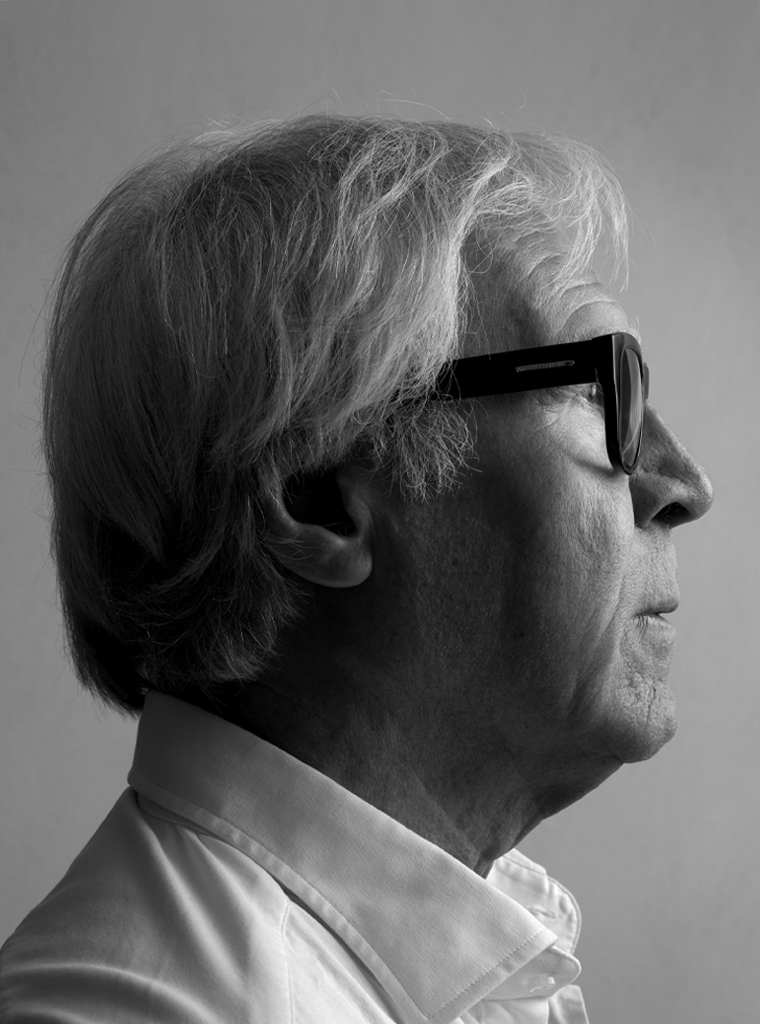
First thing you see as you enter his studio in Leusden is the rusty steel sculpture outside in the garden: Imploded Column by Ewerdt Hilgemann. Even though it is placed in a corner, you cannot miss noticing its prominence. Artists and the work they create are graphic designer Hans Kentie’s inspiration. Ad de Keijzer’s quiet work, Yvonne Kracht’s constructive art, Andries Copier’s green unicum vase. Kentie’s workspace is clean-lined and clear – as is the art that stirs him.
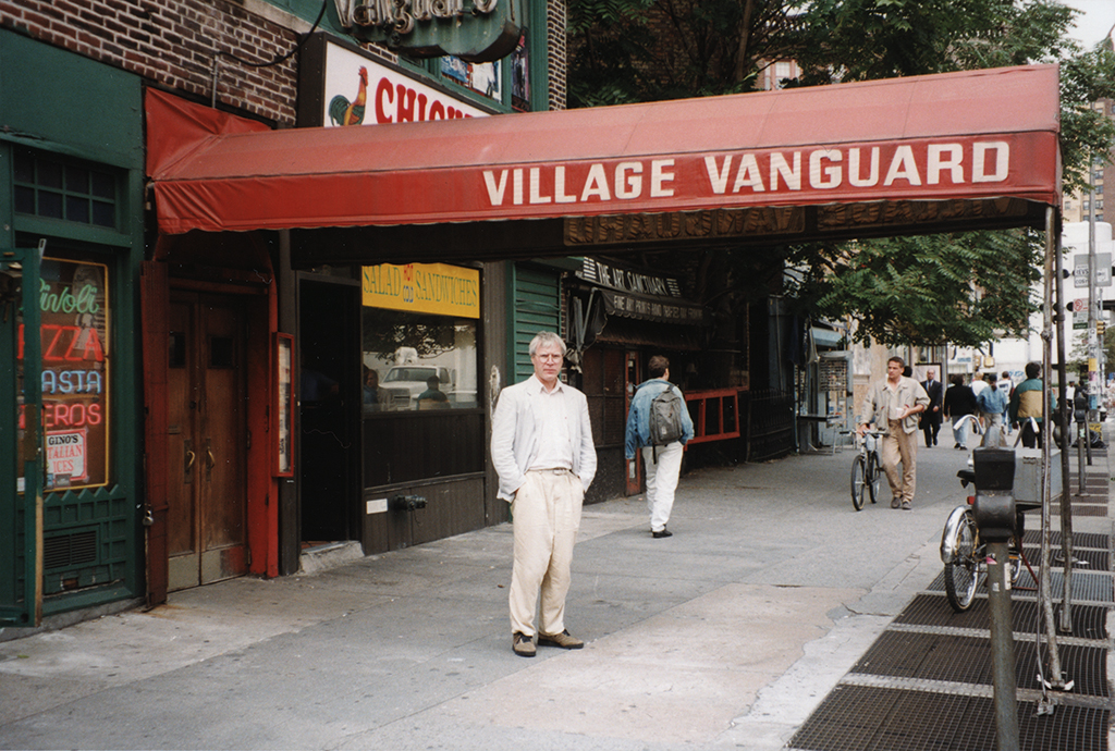
Hans Kentie in front of the Village Vanguard jazz club, New York, September 1992
Hans Kentie was born in 1946 in Leerdam, in the shade of the famous glass factory. At a young age he could be found often near the factory; he would run home with his pockets filled with what he had discovered at the trash heaps: broken parts of glassware designed by Karel de Bazel or cactus bowls by Copier, for which would find a spot in his parents’ garden. “Maybe these bits and pieces made me aware of good design. Young as I was, I experienced the beauty of the glass and I knew I wanted to become a glass-blowing artist. The material’s transparency has influenced my graphic work; my typography and the way I treat white space prove it. It is said that I handle my white illustratively. There is a kernel of truth in these words.”
The transparency of glass, the Linge River, and the Dutch polder landscape of the Alblasserwaard and the Vijfheerenlanden had a lasting influence on Kentie’s thinking and doing. In 1957, the Kenties moved to Gorinchem, where his father had found a new job. In the last year of elementary school he was placed in a special group of kids who were being prepared for secondary schooling, but his parents decided he’d better go to the LTS (lower technical education) and learn a trade. His art teacher at the LTS was Ad de Keijzer, a man with vision from whom Kentie learned much. “He taught me about form and counter form. A blown-up fragment of a letter produces a form, but the leftover space presents a similarly interesting shape. It was Ad de Keijzer who advised my parents to send me to the Utrecht graphic school.”
Between 1963 and 1966, Kentie worked four days a week at J. Noorduijn & Son publishers and printers in Gorinchem, which allowed him to attend one day of class at the graphic school. His first designs were produced at Noorduijn’s. Later, he continued to study graphic design for three years (evening class). After graduation he was hired as a graphic designer by technical publisher Stam, the future Educaboek, in Culemborg (1969-1971). His job was to typographically design school books with care and to show a great discipline while handling contents. He learned to master the design process, yet wasn’t given the opportunity to develop any personal creativity, which made it an easy decision to move on to Sdu, the Dutch government’s publishing and printing house in The Hague the moment he was given the opportunity.
Sdu published all parliamentary print and most publications of all Dutch government departments. For parliamentary publications Kentie developed a visual format, a ‘face’ for all memoranda and proposals coming from the House of Representatives, to make them more attractive also to display in bookstores. His book design for Achttiende-eeuwse Haagse boekbanden (1976, for Koninklijke Bibliotheek/Museum Meermanno Westreenianum) used a flexibel grid. Kentie also designed two commemorative books for the Dutch national trust (Rijksdienst voor Monumentenzorg): Schetsen uit de geschiedenis van de monumentenzorg in Nederland (1975) and Een eeuw strijd voor Nederlands cultureel erfgoed (also 1975). In 1976, he used a typewriter letter in combination with handwritten corrections in the text for the parliamentary publication De Troonrede van Ridderzaal naar huiskamer. The publication was an initiative of the House of Representatives’ president, Anne Vondeling, who wanted to simplify the text of the Queen’s speech at the opening of the parliamentary year and reach more citizens. Kentie also designed the publication for Teleac’s television course Parlement en politiek (1977) and the fiscal report Inflatieneutrale belastingheffing (1978).
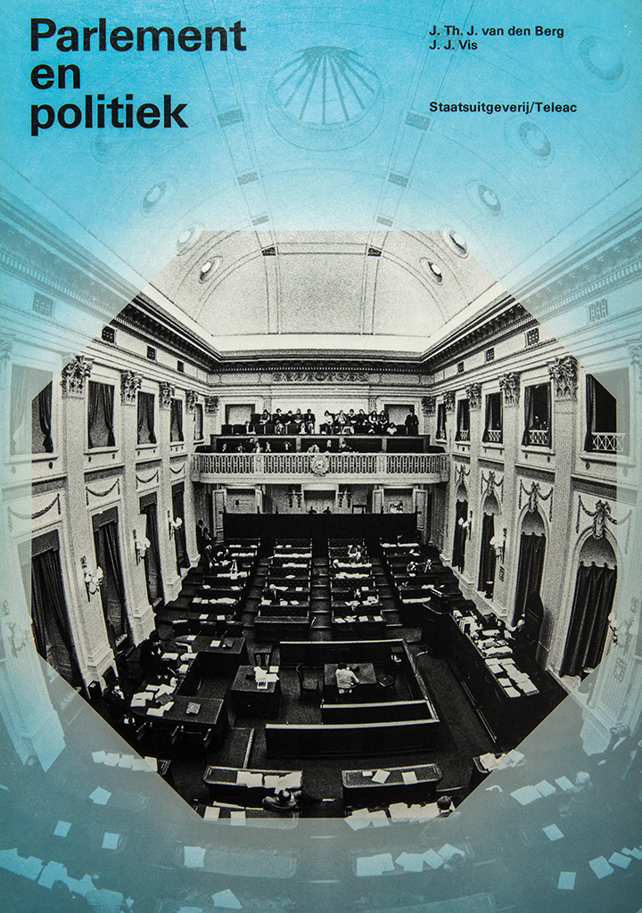
Cover, course book Parlement en politiek, Sdu/Teleac, 1977
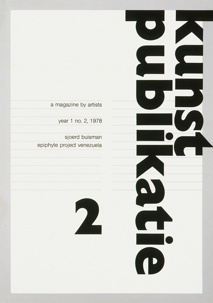
Cover, artists magazine Kunstpublicatie 2, art center Het Badhuis Gorinchem, 1978
In these publications one can trace the influence of Gorinchem as a center of geometric abstract art on Kentie’s design. He was close to Ad Dekkers, Jan van Munster and Marinus Boezem, artists he had first met at age sixteen. The geometric visual language of Dekkers fascinated him. Kentie also got acquainted with the strict art of Francois Morellet, Peter Struycken and Richard Paul Lohse that was on display in the local art center Badhuis, for which he designed their magazine Kunstpublicaties. His discovery of the conceptual art by Marinus Boezem led to insights that would influence many of his future designs. Another important experience was the international sculpture symposium that took place in Gorinchem in 1974.
Down to earth
In 1976, Kentie left Sdu to enter the employment of Grontmij in De Bilt as their in-house designer. The new job came with more commercial pressure. The design culture at Sdu produced books with a neutral but recognizable appearance, almost detached from their social relevance. At Grontmij they were down to earth and outspoken; no one hesitated to show an opinion or a viewpoint in their richly illustrated reports. “Grontmij was a decentralized company that allowed all regional offices to develop their own policies and their own ways of communication. I didn’t want to force a uniform, centralized design approach onto their unique individualities. Nevertheless, the communications had to show that all of them were connected after all. How to use wording, colors, and visuals to make clear that all these individual units were member of the same family? I had to be more than just their graphic designer. In the annual reports I presented themes and visual associations in such a way that stories were told showing the full strength of Grontmij as a whole.” Information about their services and about water management and environmental techniques was included in brochures and annual reports; in 1979, the theme was: Environment, air, water, soil. Kentie designed not just their print, but also Grontmij’s trade fair presentations in Amsterdam and Utrecht.
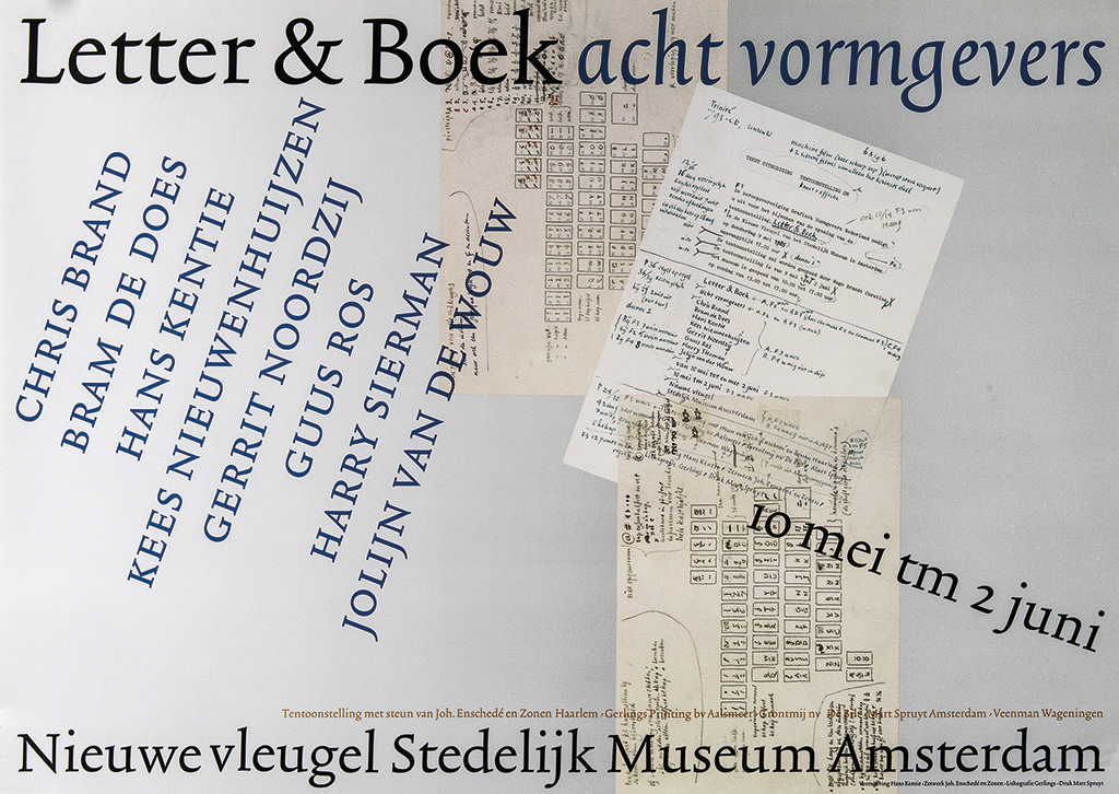
Poster, GVN exhibition Letter & Boek – 8 designers, GVN/Stedelijk Museum, 1985
In 1985, GVN (the Dutch association of professional graphic designers, later BNO) published an invitation, poster and small book on the occasion of the exhibition Letter & Boek, Acht vormgevers in the Stedelijk Museum, Amsterdam. The exhibition included work by Chris Brand, Bram de Does, Hans Kentie, Kees Nieuwenhuijzen, Gerrit Noordzij, Guus Ros, Harry Sierman and Jolijn van der Wouw. The GVN publication, Letter & Boek. 8 x Battus, had a text written by Hugo Brandt Corstius (Battus was one of the author’s noms de plume). “Each of the eight of us had to contribute the design of two pages of text by Battus. It became a unique publication and the participation inspired me immensely.” Kentie also designed the poster and used the (at the time) new font, Trinité, and for illustrations, copy sheets by Bram de Does.
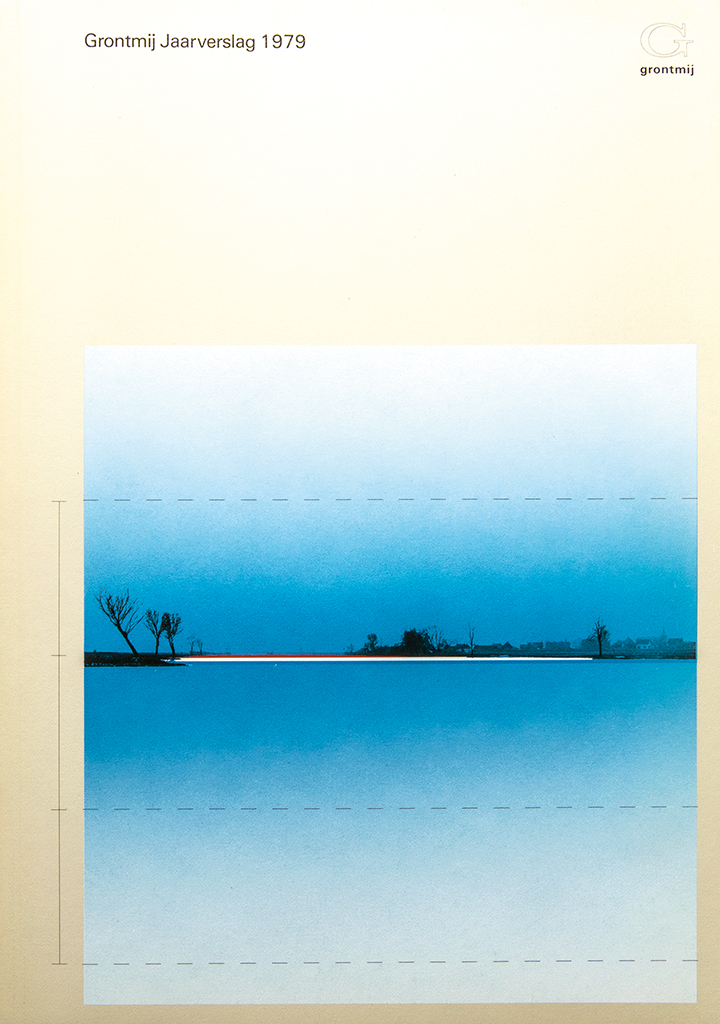
Cover, Grontmij 1979 annual report, 1980
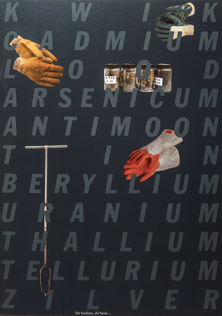
Cover, Grontmij publication De bodem, de basis, 1986
Storytelling
“Storytelling design – trying to create a dialog between the company and the user, the reader. That is what I am doing,” said Hans Kentie. In 1979 he moved from Gorinchem to the suburb Rozendaal in Leusden and into one of the so-called Eurowoningen designed by the architect Henk Klunder. He had gotten married to Alie van Iperen in 1970 and by 1979 the couple had two sons, Ward and Rik. In 1986, Kentie became a freelance graphic designer and consultant. “When I left Grontmij, a number of projects were continued. Their brochure De bodem, de basis (1986) was my first project as an independent designer; it told about soil management. I looked left and right to find images that would help to make the text understood: a row of jars filled with soil samples; an oxygen mask; rubber work gloves; a shiny yellow safety helmet with safety glasses; Wellington boots; cut-outs of terrain maps, etc. I only used small, detached full-color images; they appear to float in large white spaces next to or beneath text columns. They may appear to be pleasant images until you discover they express shame and reproach of what they stand for.”
1986. Hans Kentie was the winner of the calendar design competition organized by the graphic industry magazine Graficus. His calendar about Mondrian, Wisselwerking, was commissioned by Haags Gemeentemuseum and Grontmij. In 1987, he designed a calendar with work by photographer Cor van Weele. Both calendars became collector’s items. “Each year Grontmij had published a calendar that presented the work of realist sculptors. My opinion was that figurative sculpture neither suited the times nor Grontmij’s culture. I designed a calendar with Jeroen Henneman’s more relevant and contemporary work.” For the Mondrian wall calendar Kentie collaborated with Herbert Henkels, a curator and the recognized Mondrian expert of Haags Gemeentemuseum. The grid’s measurements are based on the golden rule; on each page either one large or several small images of paintings and drawings are arranged in a clear lay-out; included are the calendar data and information about Mondrian and the locations he used. The last page presents all art styles of the Mondrian years and maps of the areas where he had lived.
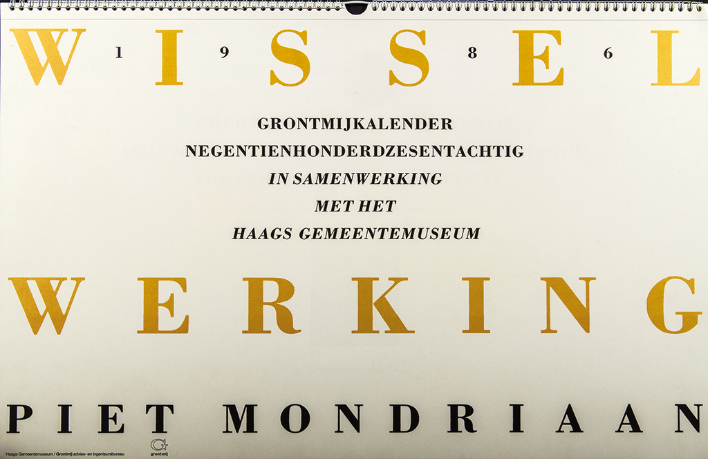
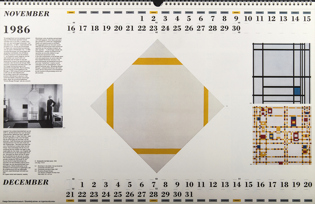
Calendar, Wisselwerking, Piet Mondrian, Grontmij/Haags Gemeentemuseum, 1985
Kentie designed many calendars. One about Floris Meydam unica (2000) was published by Drukkerij Den Dunnen in Leerdam on the occasion of the new millennium. Kentie selected images from the 1999 book about Meydam’s unique glass designs. Culture for candy (2001) was about eating sweets in different cultures; the client was Van Melle in Breda. This calendar was produced in collaboration with World Press Photo; they had organized a masterclass for talented young photographers from different countries; the calendar’s images refer to their different cultures. To each page, two removable postcards were added. The typography of the calendarium followed the atmosphere of Van Melle’s products.

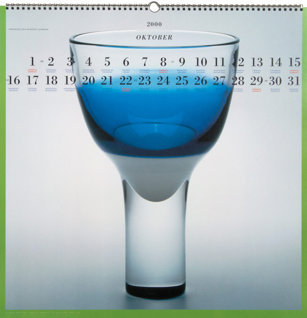
Calendar, Floris Meydam unica, Den Dunnen Leerdam, 2000

Calendar, Culture of candy, Van Melle, 2000 (photo: Cindy Schatz)

Logo, Gezondheidsraad, 1987
An early Kentie client was, in 1987, the Gezondheidsraad (Dutch health council). Kentie designed their logo and identity program as well as a typographic system for their word processors that facilitated their own staff to create decent lay-outs for their reports. Posters, brochures and invitations to international congresses became a part of the deal.
Drukkerij Equipage in Assendelft was the initiator of a project for a series of posters by different designers, each of whom would be allowed to choose the theme they wanted. The project was named ‘594 x 841’, a referral to the A1 paper size. In 1988, Kentie was the ninth designer to be involved. The subject he favored was De groene kathedraal (The green cathedral), a land art project near Almere by Marinus Boezem. Kentie called his poster ‘Lay-out/Land-art’ and its presentation was accompanied by jazz pianist Jasper van ’t Hof, who played his own composition based on the lay-out of the ‘cathedral’ and the rhythm of the printing presses.
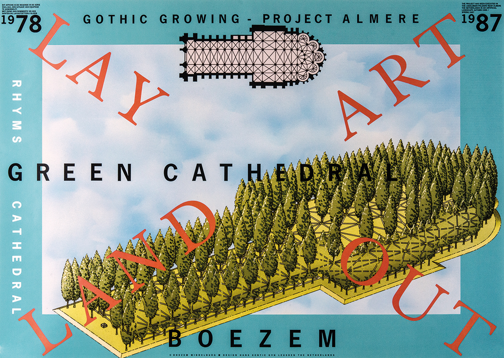
Poster, Lay-out/Land-art, Equipage Assendelft, 1988 (illustration: Kees Muller/NIC)
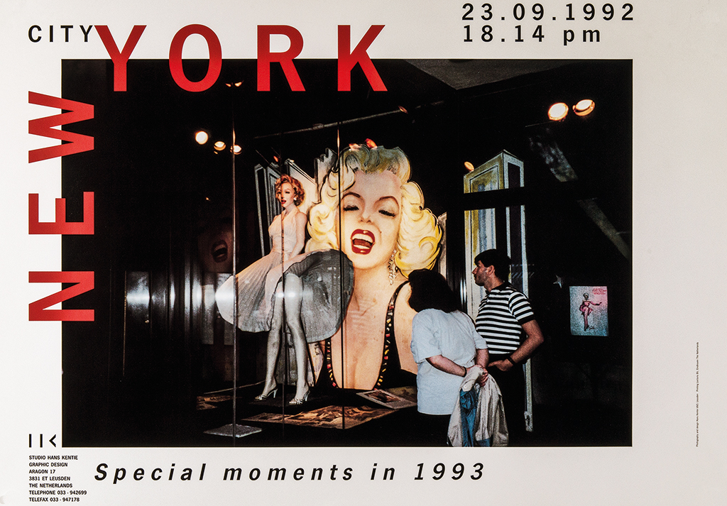
Poster/New Year’s wish Special Moments, New York City, 1993
Rhythm
Music is Kentie’s third source of inspiration, the others being the Alblasserwaard/Vijfheerenlanden regions and contemporary visual art. He has played the tenor sax since age fifteen, even with the Gijs Hendriks big band that won the coveted Wessel Ilcken award in 1972. “Measure and rhythm have always played a role in my designs. I was inspired much by the jazz scene, especially the more abstract and improvisational avant-garde. I visited the entire jazz circuit of New York, which resulted in my New Year’s wish, New York City. Special moments, in 1993: a photo of Marilyn Monroe in a show window in Greenwich Village with two persons looking mesmerized at the Monroe paraphernalia on display. I had a long conversation with the jazz drummer Max Roach, the great bebop pioneer.”
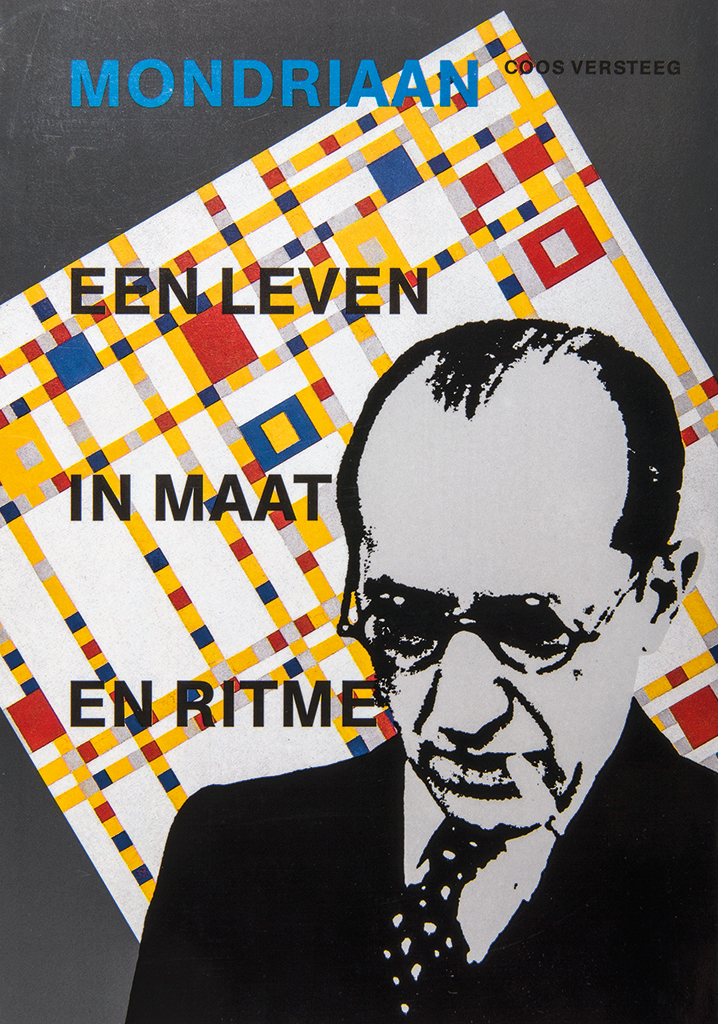
Cover, Mondriaan een leven in maat en ritme, Sdu, 1988
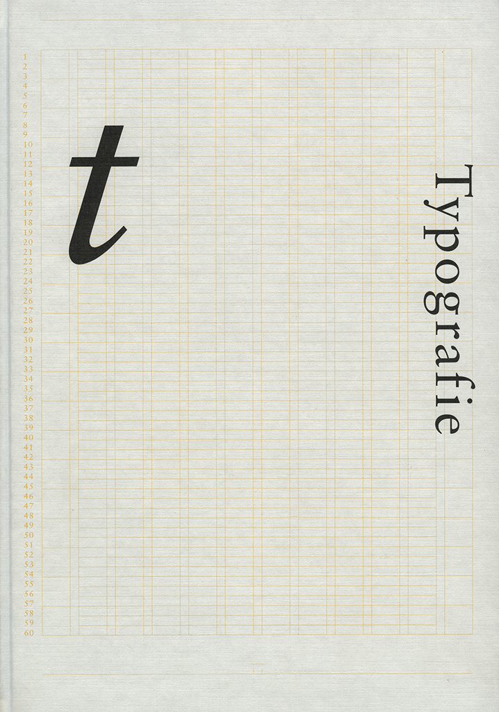
Cover, study book Typography, Grafisch Opleiding Centrum, 1990
Typography was published in 1990 by the publishing department of Grafisch Opleiding Centrum Amsterdam as the 14th publication in a series of graphic manuals and study books for students at graphic schools and art academies. Kentie chose an image of an art piece to open each chapter with, which was related to the chapter’s contents; he wanted to underline the artistic elements of typography. The book’s cover is illustrated with the typographic grid he used inside.
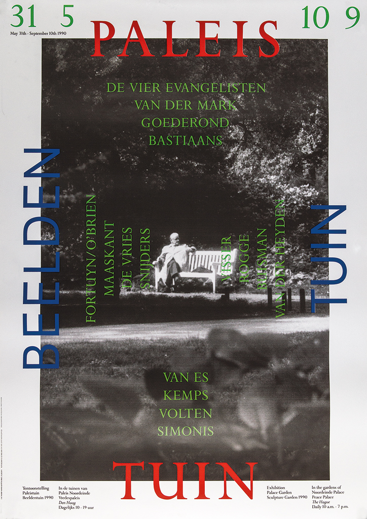
Poster, exhibition Paleistuin beeldentuin, theme: look and reflect, The Hague, 1990
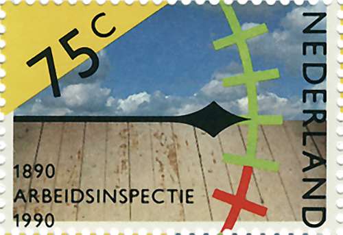
PTT Post stamp, theme: 100 jaar Arbeidsinspectie, 1990
Hans Kentie’s philosophy jumps out from the postage stamp he designed for PTT Post on the occasion of 100 jaar Arbeidsinspectie (100 years of labor inspectorate); the process was coordinated by DEV’s Paul Hefting. “A serene sky photographed above my beloved polder landscape in the Alblasserwaard – there is no more appropriate imaging of freedom and humanity.” The actual question of how to proportion working hours and leisure time is caught symbolically in the stamp. Workspace floors, photographed by Alfred Birnie, have to endure many generations of workers who leave behind traces of their presence in a script of signs and structures; the needle rests on an imaginary horizon and points toward the green part of the gauge, indicating that the labor conditions must never return to the red zone. The inspectorate’s task is not confined to controlling the circumstances: they also signal what is desirable as a policy, which Kentie indicated by including a yellow triangle.
Philips
In 1991, Kentie was commissioned to design the book commemorating 100 years of Philips industries: Philips Honderd 1891-1991. Ten periods of ten years each were described in text and richly illustrated by collages of images. Grafisch Nederland magazine wrote: “This is a book like few others.” Hans Kentie: “During a dinner party after the book presentation I came to talk to Bob Verheeke, the Philips board’s secretary. I told him that their annual reports looked ugly. A day later, I was sitting at the table across from the chairman of the board, Timmer.” Their conversation led to Kentie designing the Philips annual report 1991 and the corporate brochure Elegance in electronics. Kentie had René de Wit and Pim Vuik photograph the products in black and white as if they were buildings; and Taco Anema shot the portraits of the relevant product designers (in full color) in the different cultural environments of the countries of their origin. Sketches, atmospheric images and more product images were added. Both publications were mentioned among the best ten of Europe by Graphis Annual Reports.
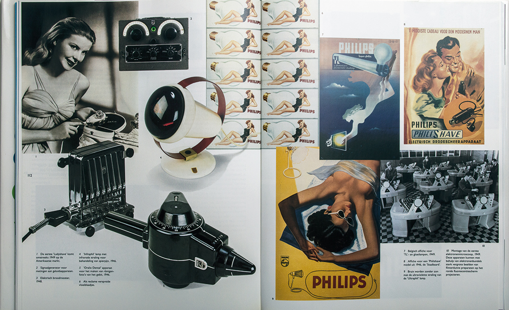
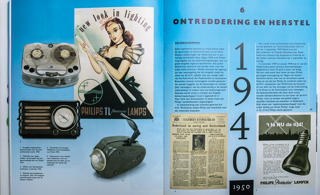
Spreads, commemorative book Philips Honderd 1891-1991
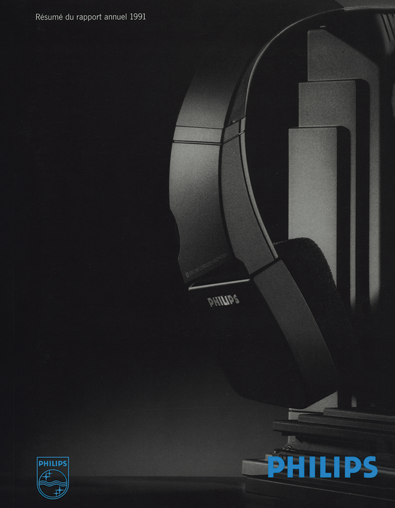
Cover, Philips 1991 annual report, 1992
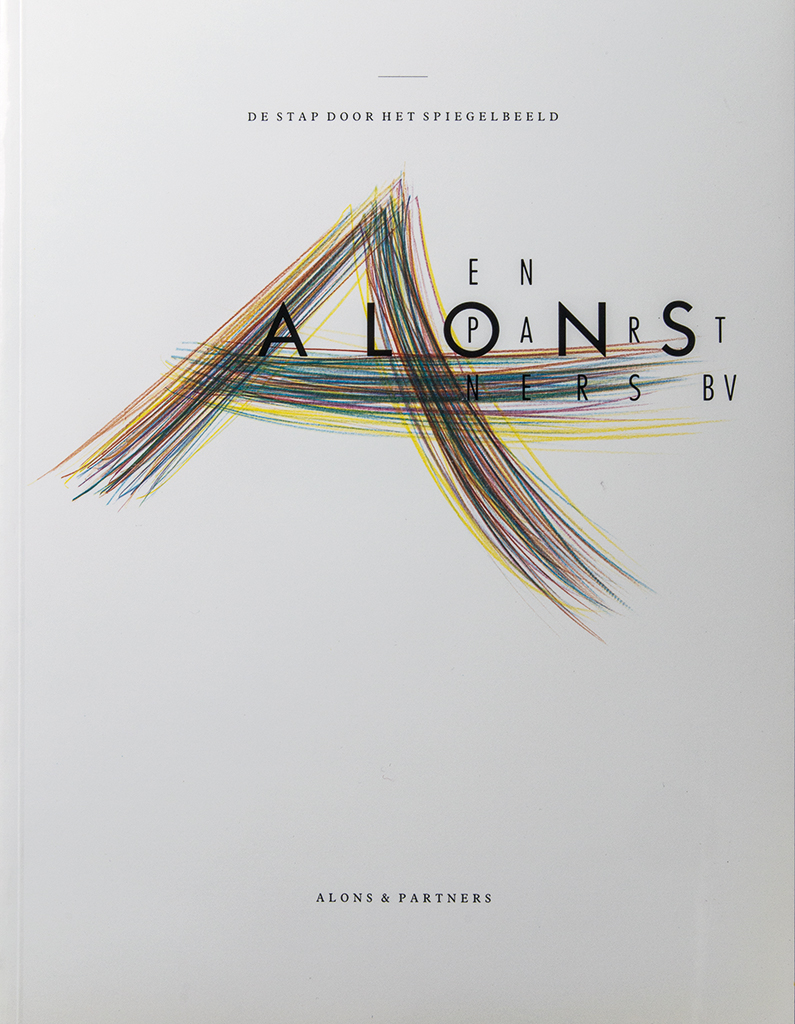
Cover, corporate brochure, Alons & Partners, 1992
1992. Kentie used the calligraphy of the artist Yvonne Kracht for the brochure introducing Alons & Partners (change consultants) in The Hague, De stap door het spiegelbeeld (Through the looking glass). He had designed their corporate identity two years earlier; they did not want a traditional logo but a somewhat spiritual image; the design can be found in Graphis Logo 2 with 499 other of the selected most innovative logos. In 1993, Kentie developed a high-end box presenting product brochures for Luxaform International, a German furniture producer. Van Zanten Trading in Beesd (Netherlands) designed a collection of sofas for which Kentie helped choose the product names: Estrada, Familia, Figura, Insula. “Each product line had its own logo in the primary colors and green, which could also be found on the box and in the brochures. The idea was to visualize the skin as it is in contact with the sofa; close-up photos of human skin were combined with large images of the sofas. Godert van Colmjon wrote the copy. Taco Adema’s photography helped give the whole presentation a museum quality.”
An extraordinary project was the design of a pamphlet to be handed out to the public that had attended the Boekenbal 1993 (yearly ball celebrating literature). CPNB, KNU, Vereniging van Letterkundigen and Nederlandse Boekverkopersbond (organizations involved with the creation, production and distribution of books) used the brochure to pledge that the United Nations and the European Commission condemn and strive to end the fatwa issued by Ayatolla Khomeini of Iran, which ordered the killing of the author Salman Rusdie. For safety reasons the brochure was placed in an anonymous envelope.
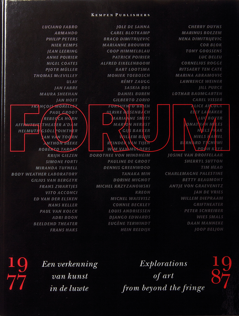
Cover, book 10 jaar Forum 1977-1987, Forum Middelburg, 1994
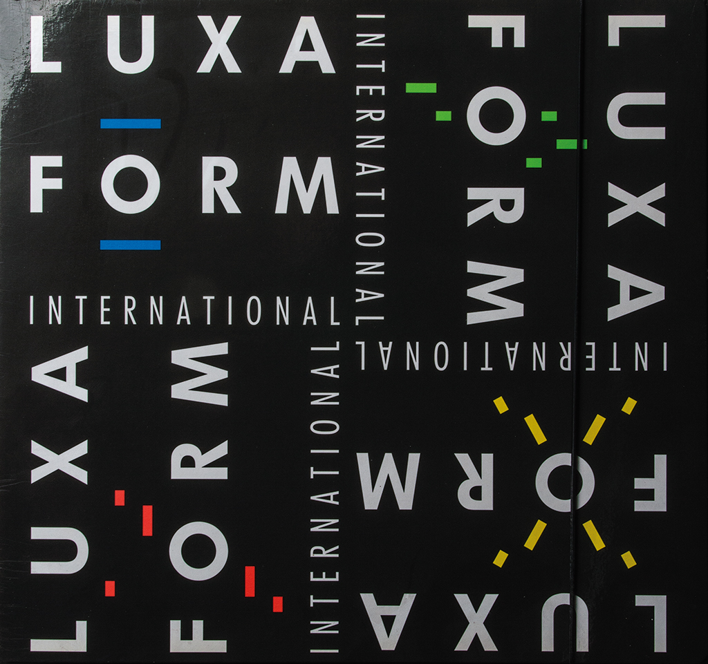
Box with brochures, Luxaform International Germany, 1993
Documentaries
Kentie first applied digital photography in the commemorative book 10 jaar Forum 1977-1987. Een verkenning van kunst in de luwte (1994). For this fat tome Kentie used black-and-white photos by Wim Riemens with texts by Maria-Rosa Boezem and Philip Peters. For each of the ten years different art projects, installations, performances, lectures and meetings in and outside De Vleeshal in Middelburg were visualized after a spread that summarized the year’s activities. The digitals were realized with help of Kentie’s son, Ward, who had graduated from Utrecht graphic school and joined the studio in 1994. Ward would take over from his father in 2012.
In 1998, Slot Loevestein and Gorcums Museum organized the exhibition Wat van waarde is… on the occasion of Gorinchem Cultuurstad 1998. Hans Kentie designed the golden-colored catalog and the poster with the image of a gold chair by the artist James Lee Byars. Kentie: “On this arrogant, self-centered and extreme piece of art I projected the names of the artists who participated in the exhibition. Many an art piece forces you to decide what you’re looking at. This chair confronts you with that question, too. I added the names to force you to form your own opinion. The chair still wins” (Kentie in Volkskrant, October 1998).
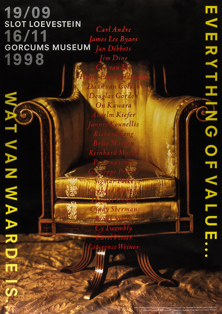
Poster, Everything of value… (with chair by James Lee Byars), Gorcums Museum, 1998
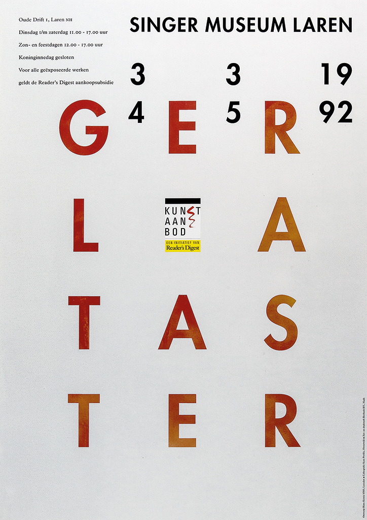
Poster, Ger Lataster, Singer Museum Laren, 1992
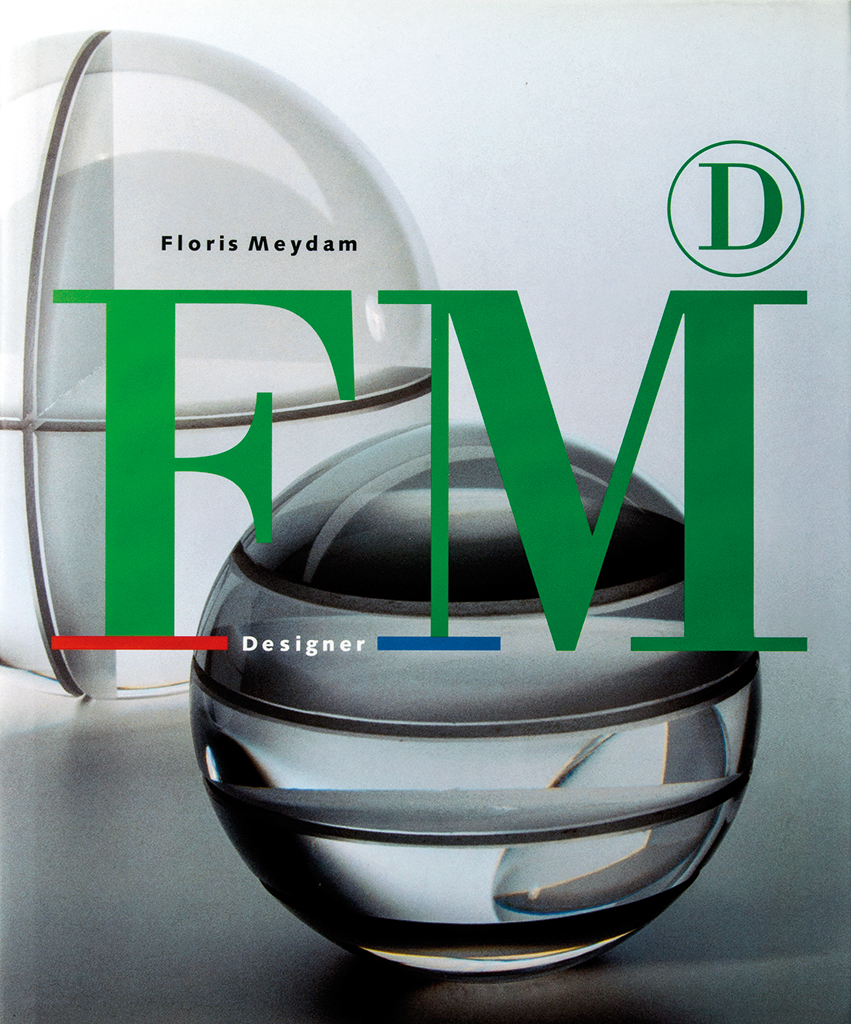
Cover, catalog Floris Meydam designer, Glaswerk Leerdam, 1997
An analytic character defines many of the projects Hans Kentie has worked on over the years, such as the logo, books, posters and invitations he designed for Glasgalerie Leerdam in collaboration with the gallery owner, Gijs Potters. The gallery was initially founded to promote the glass designer Floris Meydam’s work. Kentie produced the books Floris Meydam designer (1997), Frank van den Ham. Pahit manis (1998), Floris Meydam Glass (1999) and Neil Wilkin. Seeds of change (2001). The gallery worked with the Nationaal Glasmuseum and Kentie designed the poster for their joint exhibition Solid perceptions about Menno Jonker.
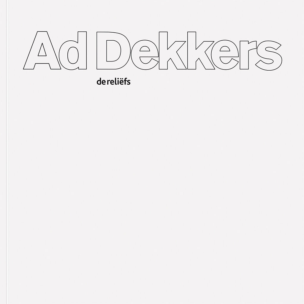
Also a long-lasting relationship was established with Gorcums Museum, which opened their doors in the heart of the city in 1995. Kentie created a logo from the elements water (blue), city (red) and the lay-out of their building (horizontals and verticals); and he continued to design their promotional material until 2009, as well as books and monographs about Arie Brinkman, Ad Dekkers, Ewerdt Hilgemann, Ad de Keijzer, Jan van Munster, De Stadscollectie, and Peter Struycken (all publications measure 20 x 20 cm).
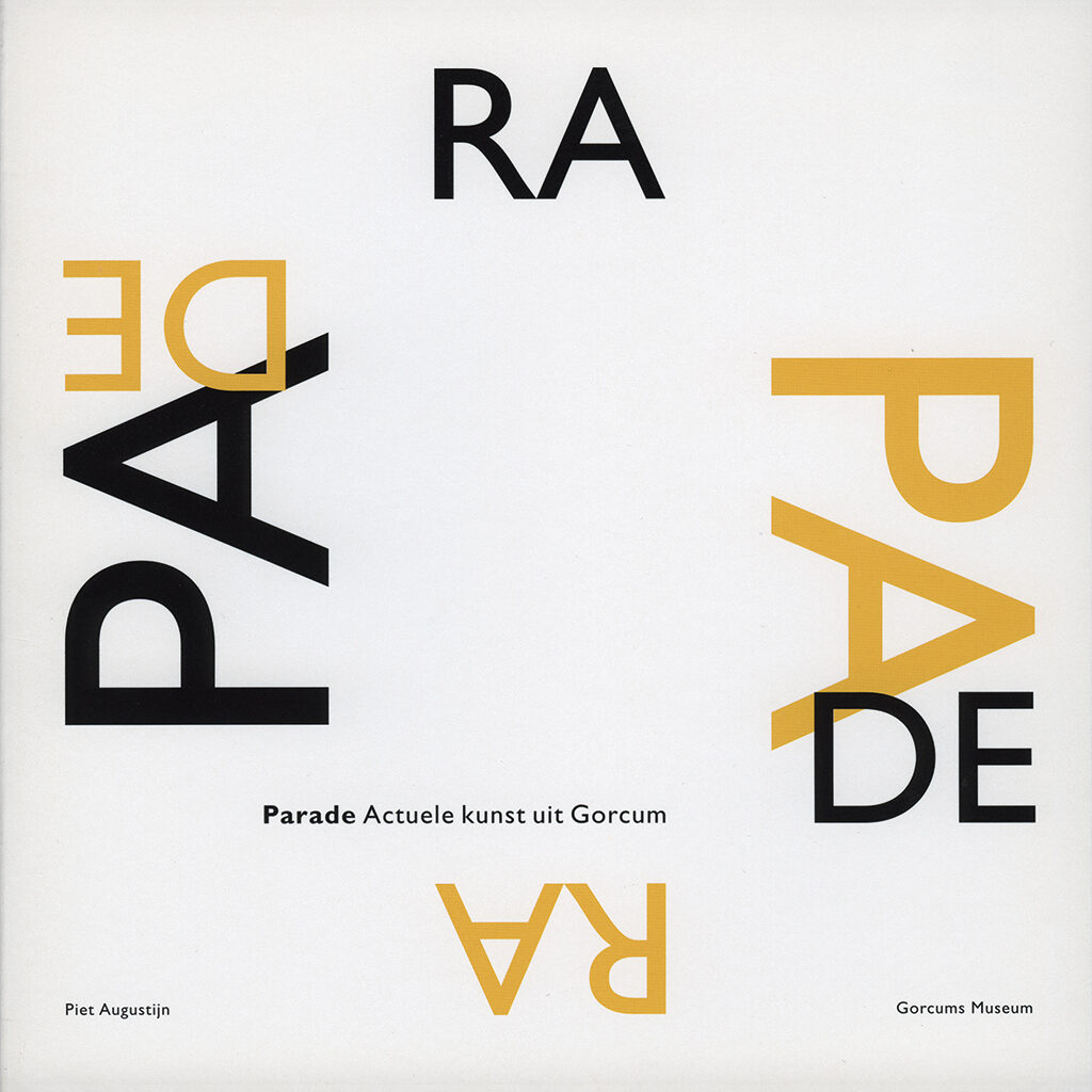
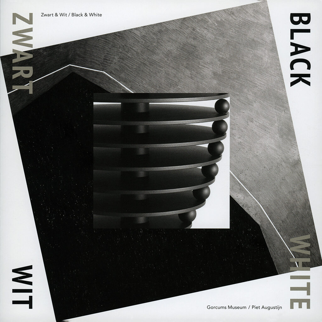
Covers catalog Gorcums Museum; Parade, Actuele kunst uit Gorcum, 2004; Zwart/wit, 2013; Ad Dekkers, De reliëfs, 2009
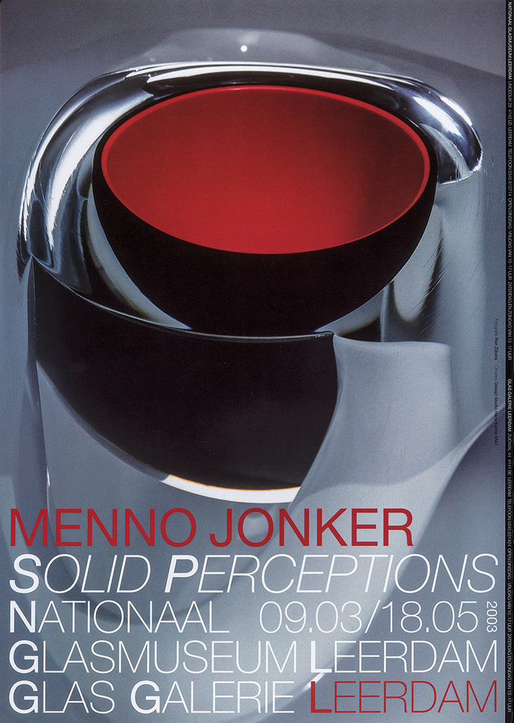
Poster, exhibition Solid perceptions, Menno Jonker, Nationaal Glasmuseum/Glasgalerie Leerdam, 2003
From 2005 to 2008, Kentie designed annual reports for Wolters Kluwer (educational publications). The first report concentrated on typography; later editions also showed images. Staff members from all over the world were photographed for the annual reports. Enlarged portrait photos were used in the design of the Wolters Kluwers presentation at the Frankfurter Buchmesse of 2006. Kentie had shown a transition from 2D to 3D design earlier, when designing trade fair stands for Grontmij and exhibition concepts for Hannema de Stuers Fundatie.
Tales of water (A child’s view) from 2006 was published by Umbrage Editions of New York together with the International Union for the Conservation of Nature (IUCN). The book was an initiative of photographer Taco Anema and Kentie was its photo editor and graphic designer. The book was introduced during the 2006 World Water Forum in Mexico City. Anema had traveled the world for situations that showed how young children experience water. Kentie looked for contrasts: water can save as well as threaten lives.
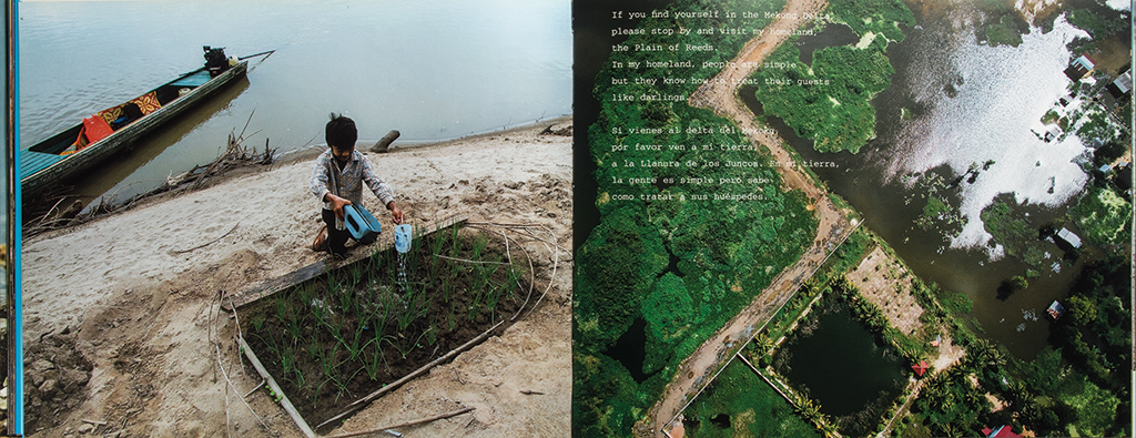
Spread, Tales of water (A child’s view), IUCN/Umbridge Editions, New York, 2006 (photography: Taco Anema)
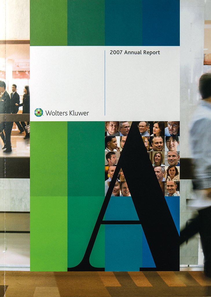
Cover, Wolters Kluwer 2007 annual report, 2008
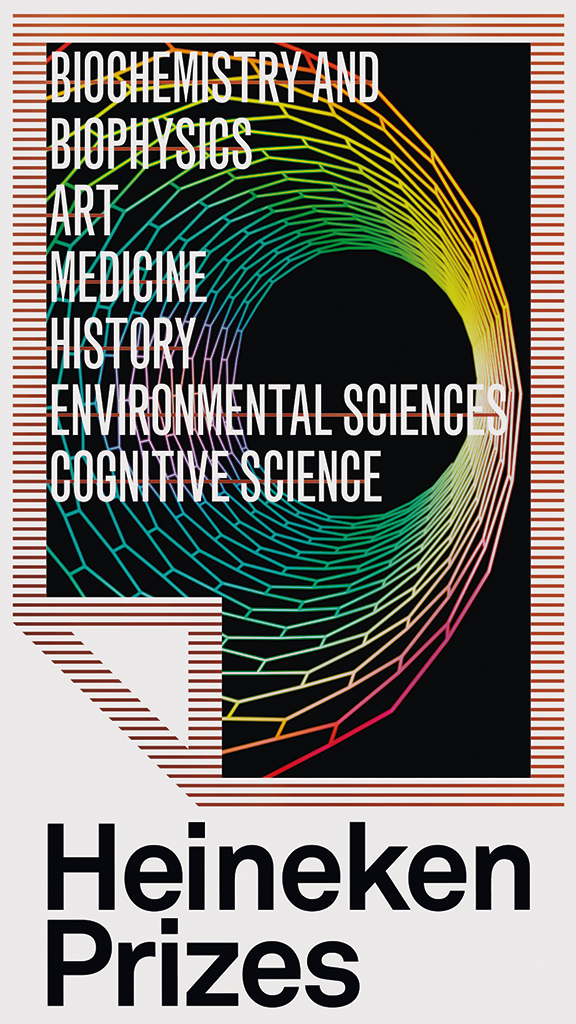
Logo, Heineken Prizes, 2014
For Essent, in Arnhem, Kentie designed their financial and CSR report over 2007. Infographics were designed for each theme in their report about the environment; staff and clients were interviewed and visualized in a special way. The Heineken Prizes for Art and Sciences were founded by Alfred Heineken in the 1960s. Every two years, the Dutch academy of sciences choses five recipients of the awards from the international arts and sciences. Hans and Ward Kentie designed the identity program of these prizes and also for the Heineken Young Scientists Awards.
Teacher
Hans Kentie taught at Akademie voor Industriële Vormgeving Eindhoven (now Design Academy) and Academie St. Joost (now AKV St. Joost) in Breda until 1992. From 1994 until 2012, he taught at Hogeschool voor de Kunsten in Arnhem (now ArtEZ – Academie voor Art & Design). In the book Industrial Design in pictures for the academy in Eindhoven (1990) Anthon Beeke, then leading their ‘Man and Information’ department, described Hans Kentie as follows: “Kentie teaches typography. That demands special skills. A typographical problem can only be solved by lining up all the possibilities and then analyzing and solving them one by one. You can’t start somewhere in the middle, because if you do, you are in trouble. Kentie’s special talent is his ability to steer the students toward this kind of ‘organized thinking’ without neglecting the artistic element, which is of course also part of this profession. He subjects his students to the visual arts, his most important source of inspiration.”
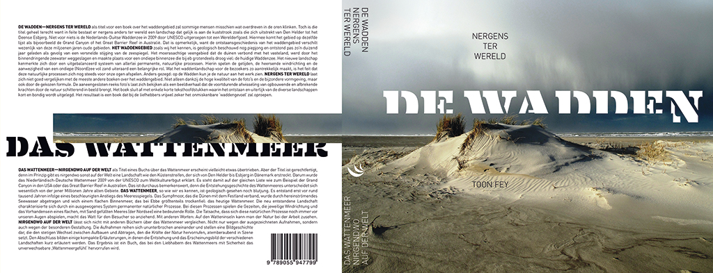
Cover, De Wadden. Nergens ter wereld, Toon Fey, Scriptum publishers Schiedam, 2013
In design magazine Items Godert van Colmjon characterized the mentality reflected in Hans Kentie’s work: “Kentie says he used to play the saxophone and had hesitated what to choose: becoming a graphic designer or a professional jazz musician. He looked up to guys like Coltrane, Shepp, Mingus and Parker. And now, suddenly, I understand more about the Dutch and at the same time not so Dutch atmosphere of his work. The necessary base of a strict pattern that allows for a solid sense of freedom. The jazz musician Kentie we lost has raised graphic design to the art of improvisation.”
Hans Kentie
born on 15 November 1946, Leerdam
Author of the original text: Piet Augustijn (Gorcums Museum), 2016
Translation and editing in English: Ton Haak
Final editing: Sybrand Zijlstra
Portrait photo: Aatjan Renders
