The 1940s
Life: Harry Sierman was the oldest of five children from his father’s second marriage. A hosiery trader, his father was comfortably off and living the good, quiet life with his family at 68 Keizersgracht in Amsterdam’s predominantly roman-catholic neighborhood.
At one time he and his brothers were watching the news bulletin in the Cineac movie theater when, suddenly, an alarming message was projected on a side screen: ‘The young misters Sierman have to return home immediately.’ What happened? A fire? A deadly accident? The boys hurried home to get a very catholic explanation: they had missed going to altar boy training. These were the heydays of the Church, with crucifixes behind purple draperies, priests splashing sacred water to send blessings, and altar boys dressed in lace shaking glistering incense burners at the pious community of believers and covering everyone under a thick smoke. Did his catholic upbringing leave traces in Harry’s work? Surely: his belief in books, his longing for ceremony, his love of silver and ornaments.
Convinced by architect Mart Stam that this was the right decision, his father allowed Harry to enter the IvKNO applied art school in Amsterdam, which later became the Rietveld art academy. Wim Jaarsveld was his teacher of graphics and advertising; co-students Hans van Os and Herman Focke became close friends and performed with him in the school’s cabaret.
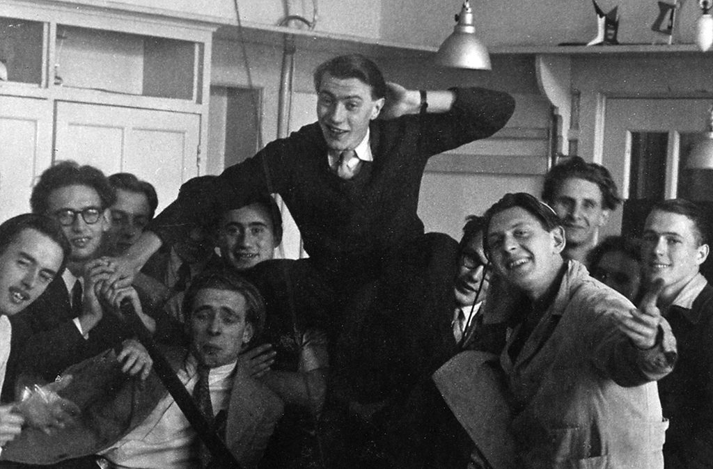
Work: Harry graduated from IvKNO at age twenty. He designed his first advertisements at home, sitting at his brand-new drawing table. Cartoonish, graphic, with type to attract attention, and almost always including a nice, historically interesting detail. He received more diverse commissions after meeting Frits van Alphen, then the director of Associated Advertising Artists. Harry worked a few years at this agency’s Prinsengracht and Keizersgracht offices until he switched to Vorstelman’s ad agency, also at Keizersgracht.
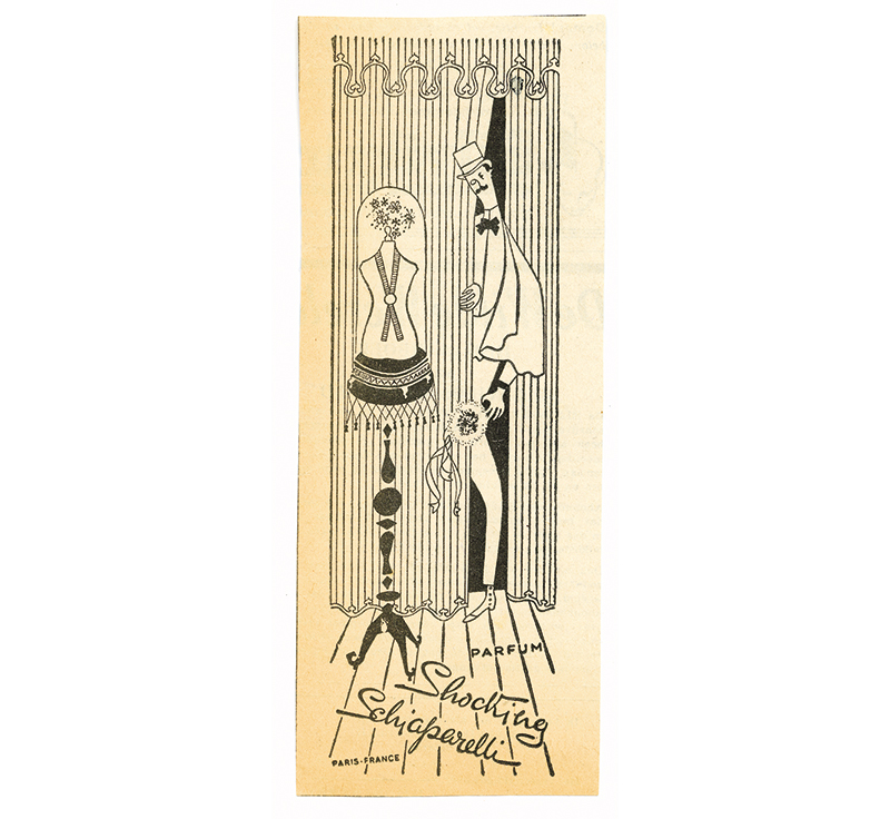
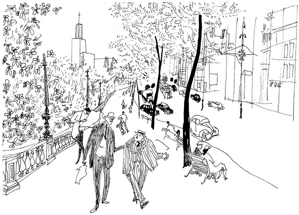
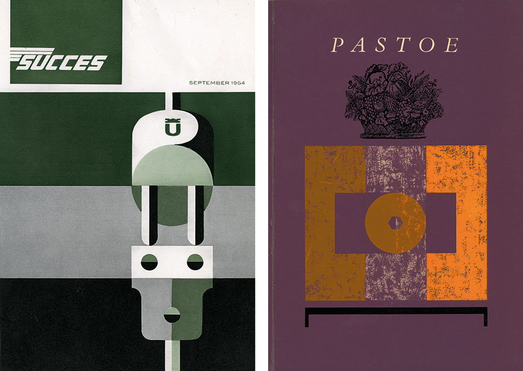
At both studios he worked either alone or together with the somewhat older Gerard Wernars. Solo, Harry produced print and ads for KLM, UMS Pastoe, Succes publishers; and posters for Bruynzeel and for RAI’s Ideal Home exhibitions. The Sierman/Wernars team created posters for the Jaarbeurs (trade fair) in Utrecht and for UMS Pastoe. After four ‘not so important’ years he was ready to start his own studio. As Harry, looking back in 1992, said: ‘It was time to leave the advertising world,’ yet quite a few of his old clients followed him.
The 1950s
Life: Harry proceeded and retreated at the same time: he established his studio at 66 Keizersgracht, next door to his parent’s home. He met Els Timmer, also an IvKNO graduate; they remained together for the rest of their lives and raised three children.
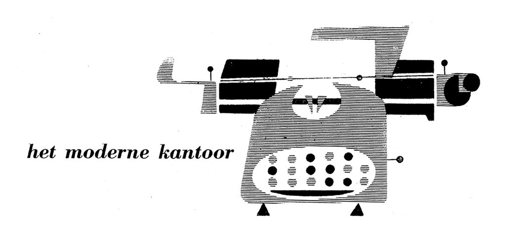
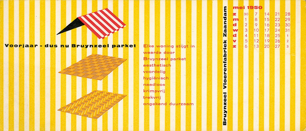
Work: A new private life, a new studio, and new ideas about design. Harry discovered he could now really concentrate on labor-intensive typography. His studies at IvKNO had not prepared him fully for the new direction of his work so he sought council from established designers, all members of GKf (the first association of Dutch graphic designers), such as Mart Kempers, Han de Vries, and of course Gerard Wernars. His true mentor must have been Alexander Verberne, either consciously or unconsciously, who at the time was connected to ‘Proost Prikkels’ and the Philips periodic publication ‘Range’ (to which also Ton Raateland contributed). Both Verberne and Sierman believed strongly in a ‘humane typography’ and in Jan van Krimpen’s lead type just as well as the then ‘boundless’ possibilities of Monotype revivals; experienced typesetters and printers could let these letters shine. To brighten up their creative labor they played organ and street organ music loud enough to alarm the neighbors.
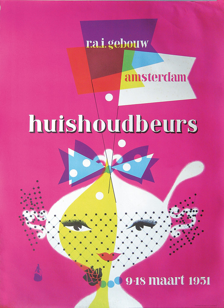
Harry transformed his handwriting along humanistic models. His instructions for typesetters, lithographers and printers may have whirled but were to-the-point if not compelling; he must have written thousands of them. These delivered proof of the birth of a designer to be reckoned with. Even his invoices to clients had Harry’s personal attention; all numbers were esthetically arranged in red and black, produced on his then so trendy Olivetti Lettera 22 with a multicolor ribbon. Harry as a rule met his clients in Hotel Polen in Amsterdam’s Kalverstraat.
The 1960s
Life: In the 1960s, the city of Amsterdam experienced a ‘heart attack.’ Traffic blocked streets, walkways, bridges. The traffic jams produced noise: horns were honking and noisy constructions were going on at all hours of the day. While his family had to endure the not so quiet street-side rooms, Harry’s drawing table was moved upstairs to the loft at the quiet rear of the house. There he was to be found surrounded by his design projects in development, beautiful designs created by colleagues, a growing number of Olivetti typewriters and a battery of one-hair brushes – birdsong entering his workspace from the gardens below. He worked long hours, but design was his game. His exuberance attracted many colleagues, clients, students and other professionals to his loft. Nothing was able to force him to leave his beloved private and professional isolation, neither the invitation to become a teacher, nor the lure of social and financial security.
Work: In these years, Harry’s development to a book designer became noticeable. A successful book design was a refined and intimate product. ‘Typography is like having a good conversation with the reader,’ he said in a lecture. Simple, uncluttered designs were important to him: a handsome type, the texture of a good paper. Clarity. Yet efficiently produced, which is why his instructions breathed clarity too.
It sounds so simple, but in Harry’s case a type could not be good enough unless it was the best. It had to be spaced well, to the extreme detail, and come accompanied by the most refined small caps, numbers, ligatures, and lines, with their contours sharply printed on carefully selected papers with great tactile qualities and the precisely right grams of weight. Matte papers, preferably. He loved to run riot by applying a surprising intensity of colors, darker as well as brighter than the paper itself, adding lively typographic ornaments, graphic illustrations and other attractive accents created in his own handwriting.
Harry was lucky enough to be discovered by excellent clients who were book lovers, too, and who backed him up at the creation of many productions: Frits Ullmann (UMS Pastoe) and publishers such as Lucas Bunge (Proost & Brandt, Oosthoek, and Bunge scientific publishing) and Reinold Kuipers (Querido).
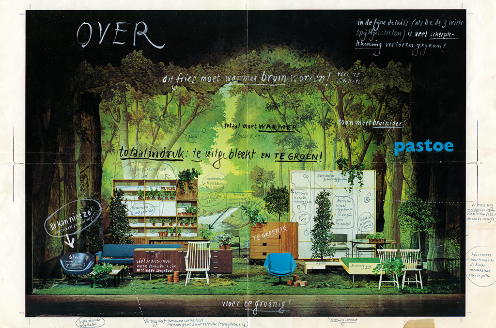
UMS was Utrechtse Machinale Stoelenfabriek, the chair factory established in 1913 and presenting its products under the brand name Pastoe. These were solid, well-detailed, often linkable chairs the buyer himself had to assemble. High-end furniture, avant-garde, well-designed and well-marketed. Pastoe in the optic of UMS stood for ‘modern’ and its messaged reflected from its catalogues. A couple of strong and outspoken design personalities guarded UMS’s philosophy: Harry Sierman with his introverted and almost bibliophile approach; Benno Premsela with his sometimes surrealist furniture arrangements and openly glamorous approach; Jan Versnel, whose photographs were embodying ‘modern’; and Vada, who produced magnificent print.
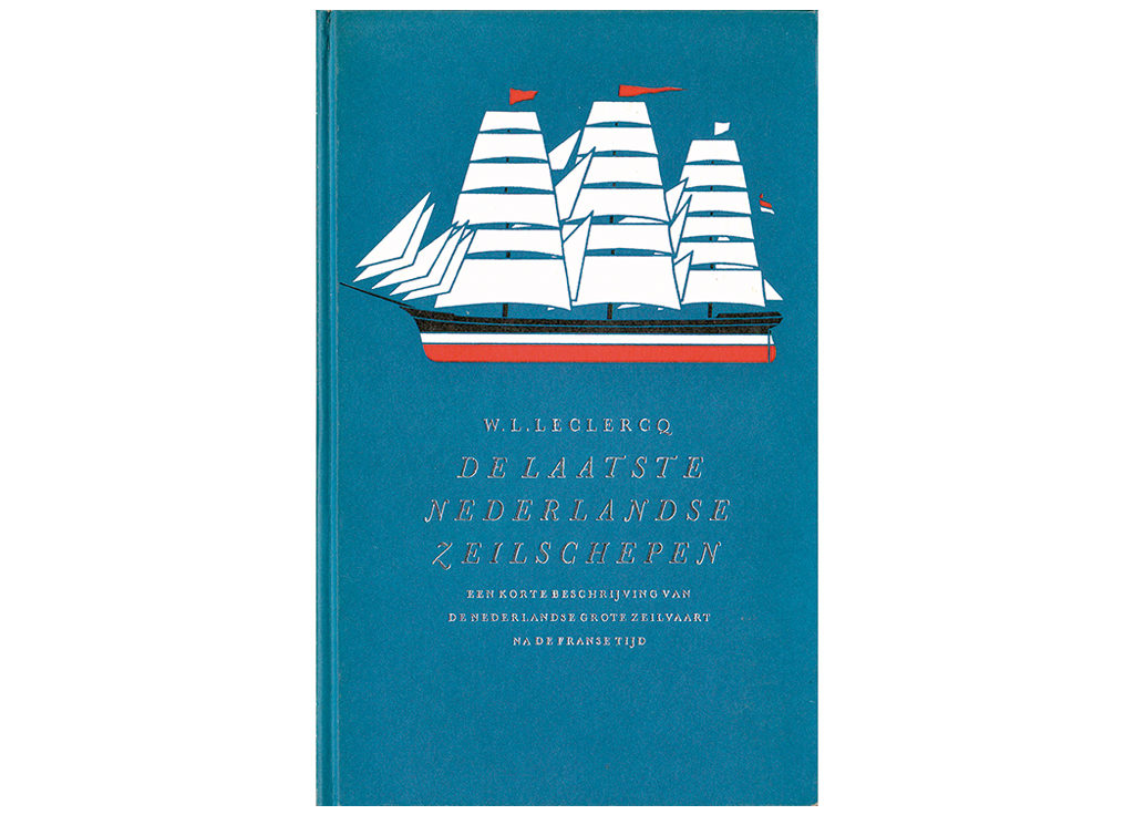
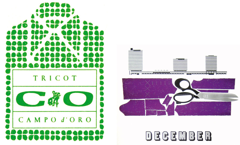
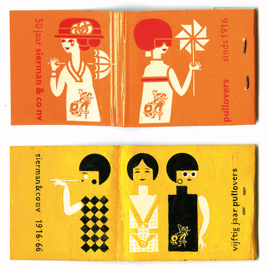
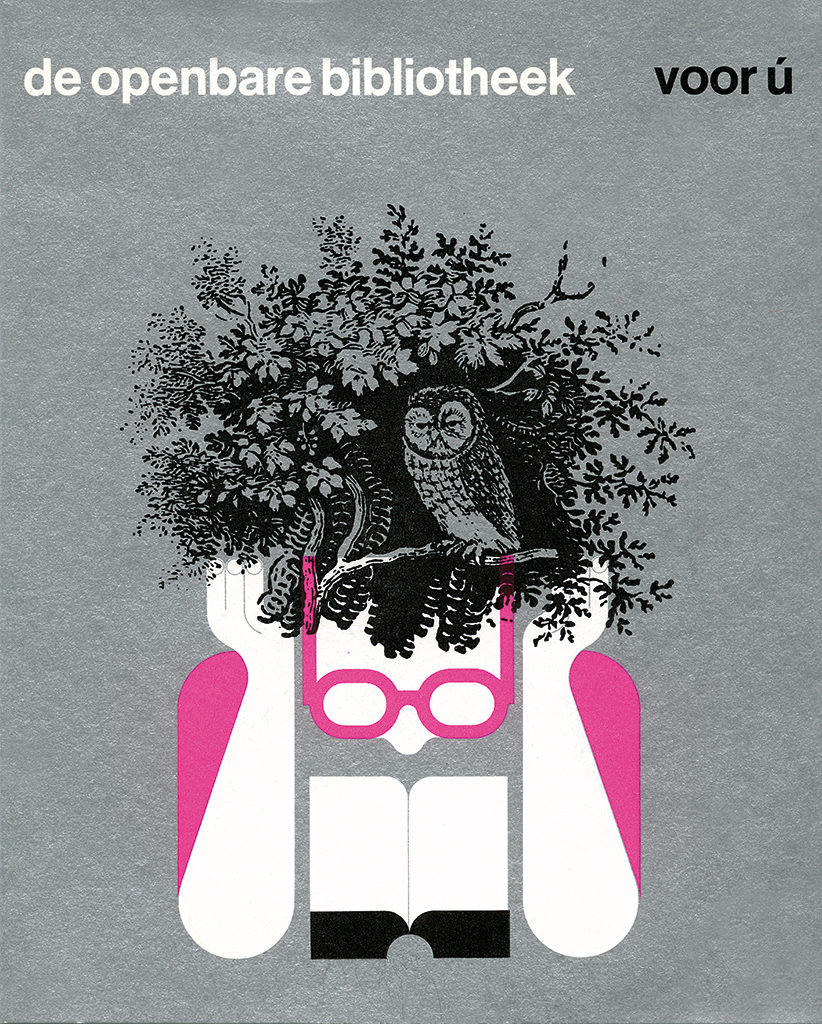
Images were important to carry over messages. For Oosthoek publishers, Harry designed a refined series of little illustrated books (about tulip bulbs, sailing vessels, the Dam square and, yes, prostitution). He also designed Mr J. Spruijt’s short history of music, ‘Van vedelaars, trommers en pijpers’. Brown and black dominated this design, its paper, its endpapers, and most typography – because, well, shouldn’t the reader appreciate subtle refinements like these, now and then? The book’s binding was a deep purple, through which the lettering appeared as if executed in lace. A new relationship began, with Querido publishers, at the same time he had to let go of another important client, the family-owned company Sierman & Co. Having run the family-owned company for years, his brothers decided to sell it in 1966, shortly after its 50th anniversary, to a larger textile group. Harry had controlled the company’s designs, from packaging to branding programs, from the interiors of company workspaces to the restoration of its premises on one of Amsterdam’s canals, and including the selection of the management’s vehicle (a Citroën DS).
The 1970s
Life: While many commissions of the 1960s had a playful character, in the 1970s projects of great importance came to Harry. Els and he managed to buy a little property in rural Friesland for a bit of peace and quiet between jobs, but Harry decided he had to create a formal garden landscape with hedges cut to millimeter precision. The garden demanded more and more of his time and an accumulation of new tools.
Work: This decade indeed favored the book, thanks to the growth of the economy and public affluence, and of offset printing. The duo Wim Alings (copy) and Harry Sierman (images and design) created, for instance, 84-page commemoration books for companies such as Meneba (grains) and E.M. Jaarsma (heating stoves). A 1979 commemorative publication for Avebe (potato flour), for which the text was contributed by the author Max Dendermonde, grew to 379 pages in large format. Fat tomes such as these were demanding productions. Handling them today, one would think: less is more.
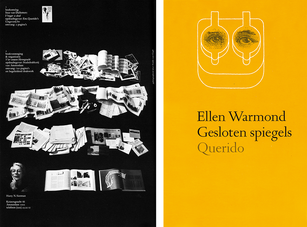
The most demanding book production was at the occasion of ‘Amsterdam 750’ in 1975. The book, ‘Vier eeuwen Herengracht’, written by H.F. Wijnman, came about a year after the anniversary, in 1976. It had cost Harry years of design and production preparations after the editors had spent almost a quarter of a century. The book was commissioned by the then director of the city printing house, Adolf Stork. Harry had to delve into old archives, get in touch with scores of photographers, and visit with countless people who lived, or had lived, along Herengracht. One day he was seen bicycling along the canal looking up in full concentration at interesting façades left and right, and crashing into a basement entrance. The ‘Amsterdam 750’ book was enormous: 720 pages, 5 million letters, 1100 illustrations plus historic drawings of thousands of houses and a register which presented 30.000 names. Harry experienced stress like never before: one day he bicycled to a meeting with city librarian Isabella van Eeghen to discuss the foreword, rang her doorbell, and fainted in her hallway. At long last, after days of proofreading and final corrections, the book went to the lithographer, L. van Leer NV. Harry could sit back and relax. Yet, at the end of June, 1975, he received the shocking message that a wild fire at Van Leer’s had destroyed all of the book’s material. Harry had to start all over.
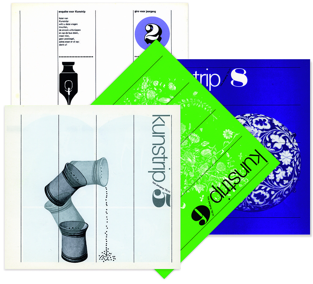
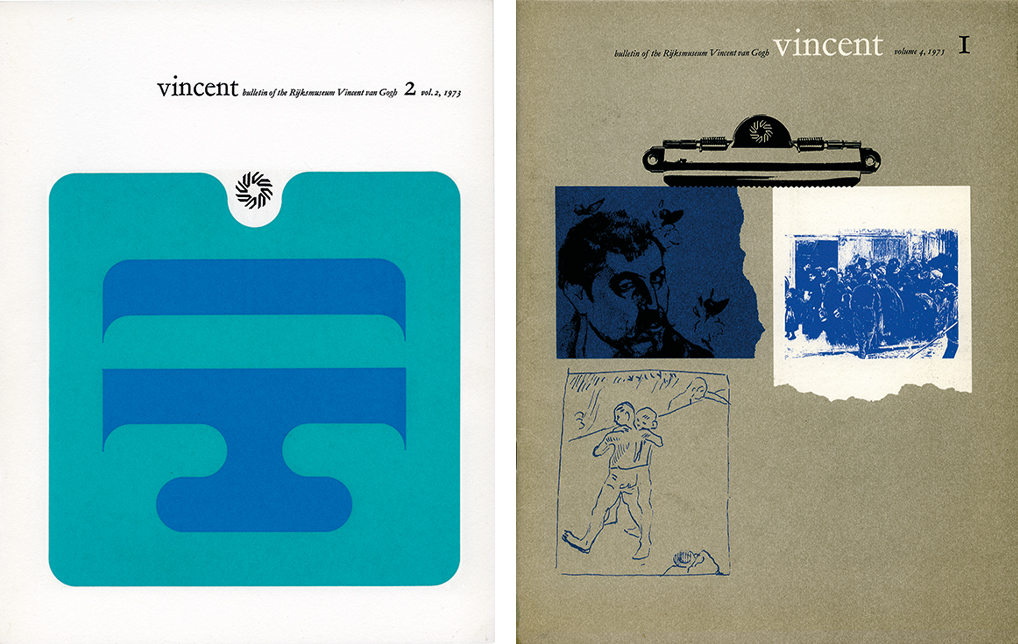
When the book came finally from the printer in the spring of 1976, its weight at birth was 14 pound. The monster production earned Harry Sierman the City of Amsterdam’s Werkman Award. Harry was exhausted. In a newspaper interview he said: ‘No trade union official would have agreed with the labor circumstances we experienced during this job.’ One of the great steps forward of this decennium was, according to Harry, the advance of jolly adhesive letters. He applied them for ‘Kunstrip’, a publication of the Rijksmuseum.
The 1980s
Life: No shocking events. Life continued.
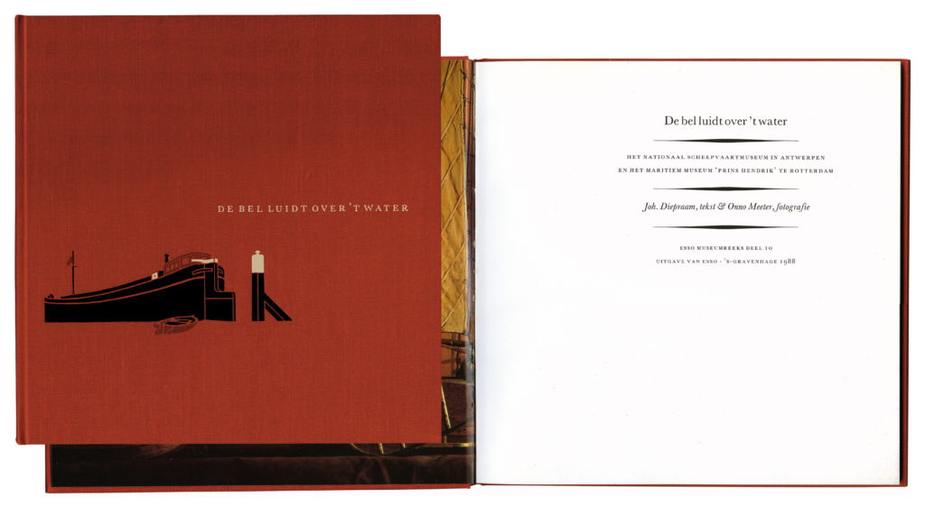
Work: Harry Sierman now really was a book designer par excellence and not only of heavy tomes. For Esso’s promotional ‘Museum Series’ he took over the design started by Donald Janssen. The creative team included Wim Brasem (text) and Onno Meeter (photography); together with Harry they created bibliophile masterpieces. The linen covers were printed in two or three colors and the type of choice was often the Trinité – but not always, for in Harry’s eye each book had its own individual character and therefore deserved an individual approach.
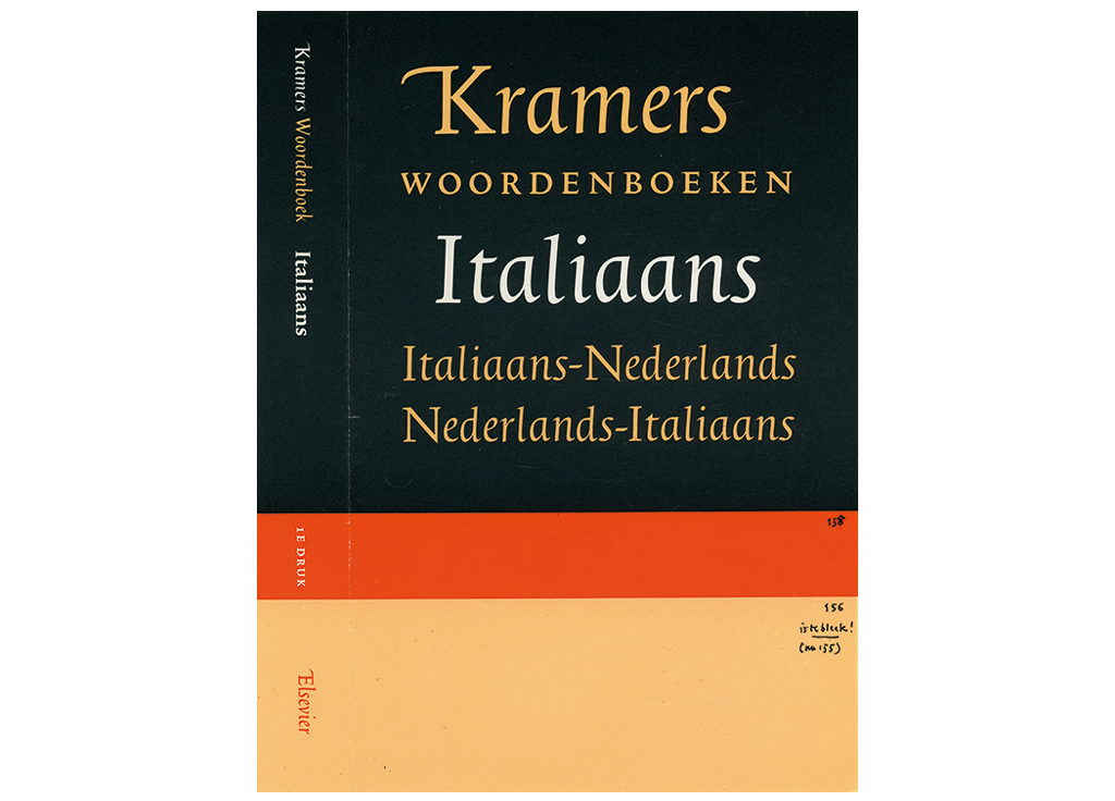
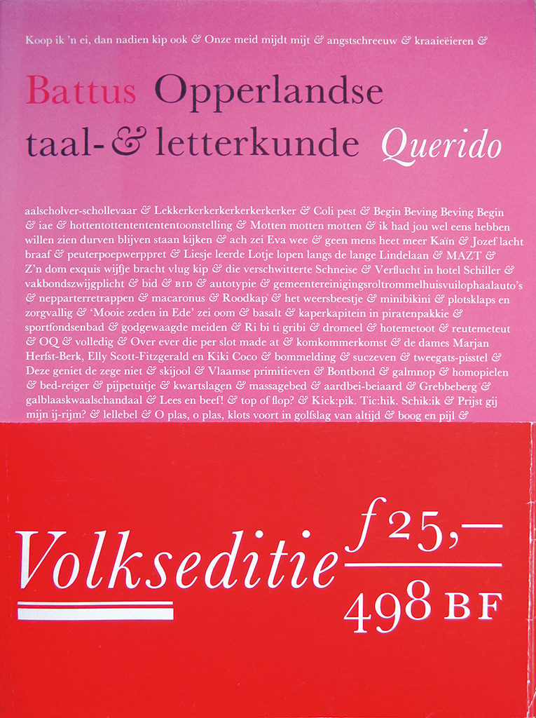
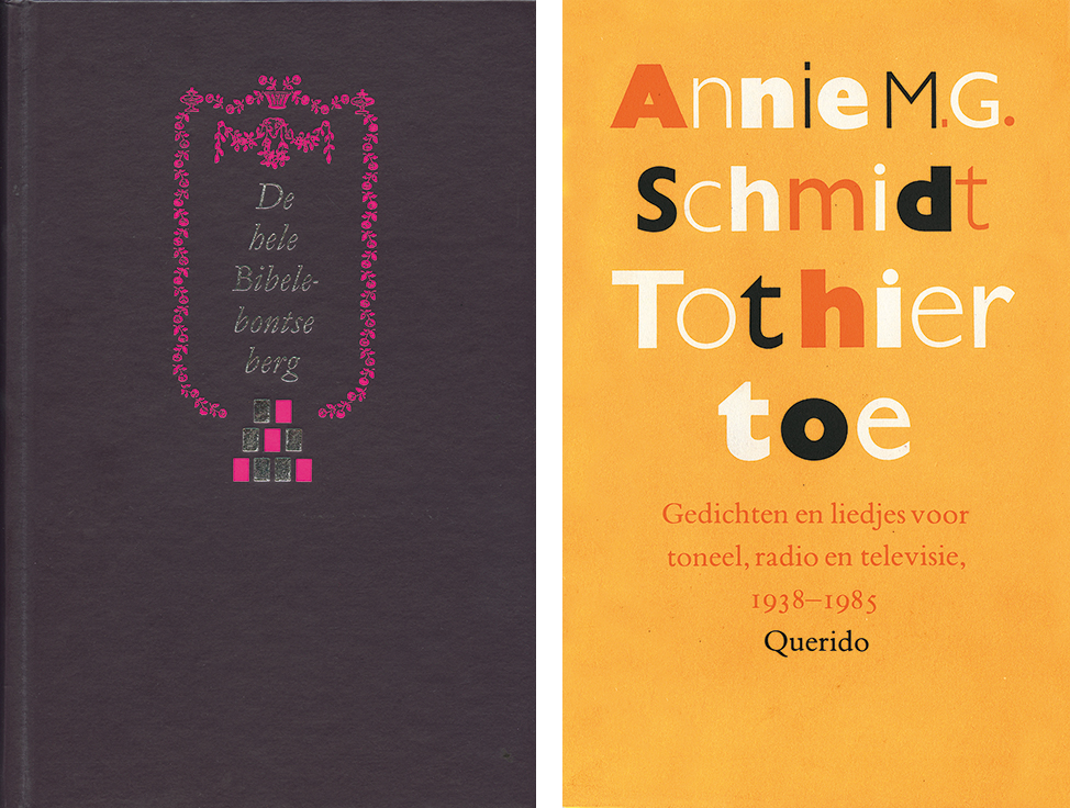
In the 1980s, Harry became the Trinité’s ambassador. This type, designed by Dutchman Bram van der Does, provided a response to the upheaval caused by the switch from lead to offset print and photographic typesetting. The new techniques did not provide a third dimension in the way lead type had by adding weight and contour to the paper. Phototype was dull, flat, weak according to Harry Sierman. Also, as Harry repeatedly said: ‘Too many different applications of the same type came about. I counted 37 different types of the Times, but the strength of the Monotype Times with its small caps, medieval numbers, and the high print quality it helped produce was gone forever.’ Luckily, with the Trinité, especially designed for phototypesetting, Harry could create quality again. He called it: ‘A democratic Romanée’ and gave the type front page. Most popular became Harry’s covers of ‘Kramers Woordenboeken’ (dictionaries), a project of the young publisher Gijsbert van Kooten, who unfortunately passed away during its production.
The advantages of photographic typesetting soon became clear when Harry designed ‘Opperlandse taal- & letterkunde’ for Querido in 1981.
The 1990s
Life: Now becoming a tool of necessity in the profession, the computer did not convince Harry Sierman he should follow the trend. He refused to accept the role of typesetter. To be able to continue his creative work, he had to look for assistents who were willing to act as his typesetters. Adriaan de Jongh was one of them. Not that Harry was averse to new technical developments or refused to learn and understand them; he attended most meetings of the bNO’s professional study group ‘Typesetting techniques’.
His 65th anniversary was celebrated in 1992. Not that he had reached retirement age. He was to receive the esteemed Charles Nypels Prize, which had been awarded to Dieter Roth in 1986 and to Walter Nikkels in 1989. The jury that decided on Harry Sierman had as illustrious members the colleague designers Wim Crouwel and Anthon Beeke, and publisher Laurens van Krevelen; its chair was printer Cor Rosbeek. Harry was expected to produce in a very short period of time an interesting exhibition and a publication about his own creative work. A stressful period followed, but on February 12, 1992, everything came together beautifully in Maastricht, where Harry’s client Lucas Bunge played the cello for an audience that included more than half of the names in Harry’s professional and private address book.
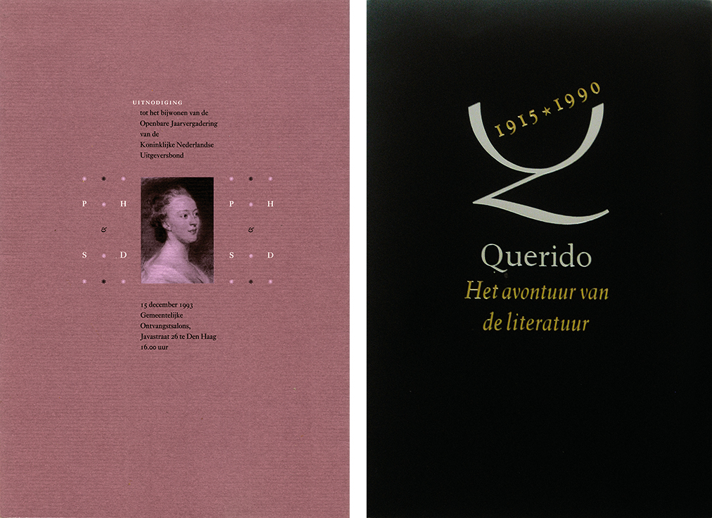
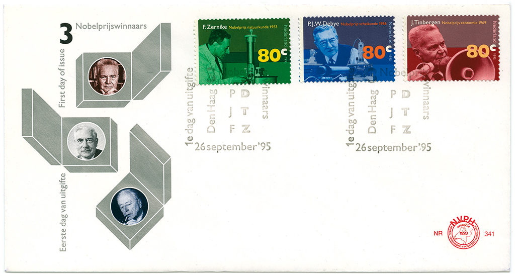
Work: The 1990s brought designer Harry Sierman lots of recognition. He was asked to design catalogues of type for Tulp and for Nauta; a series of KPN postage stamps about Dutch Nobel Prize winners; a few monographs, about Willem den Ouden and Peter Vos; and all print for the 75th anniversary of the Querido publishing house. His designs could still be exuberant but more often they were elegant, even sober and subdued; his favorite pastel color, grey, showed up frequently, in different intensities. His favored inks remained matte, his papers rough; contrasts were less noticeable, caps became smaller and smaller.
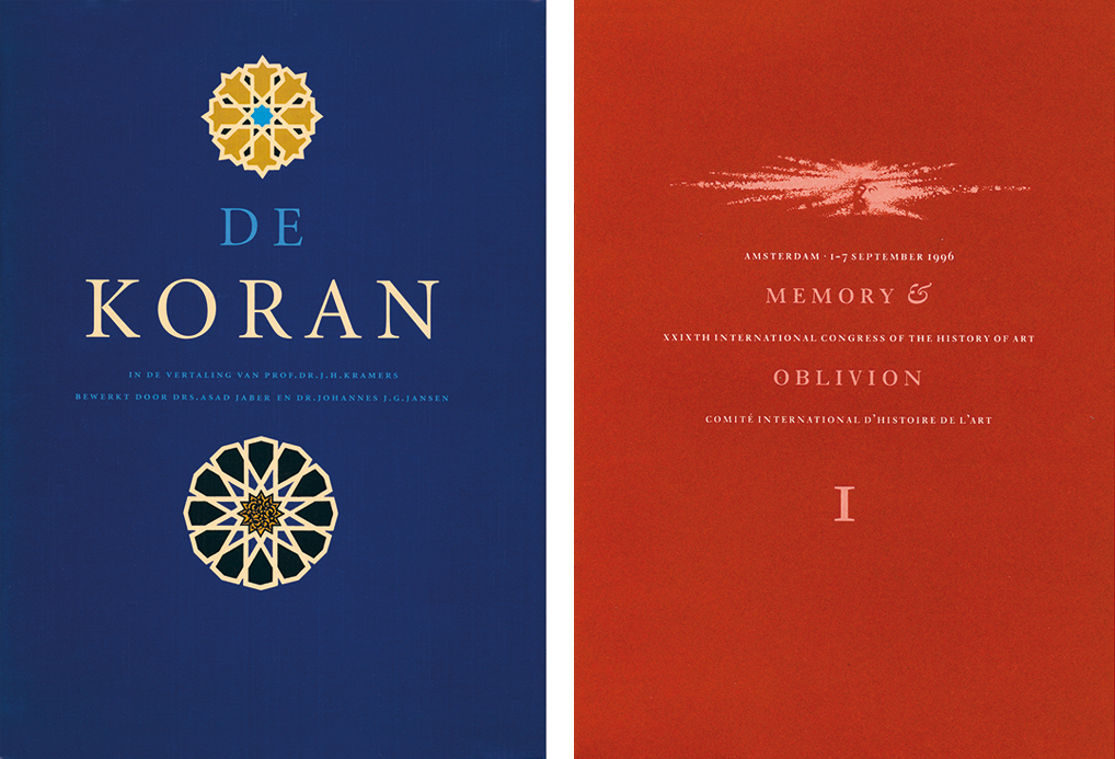
Years ago Harry had designed the Arabic-Dutch dictionary. Now he was commissioned to design the Koran for Agon publishers. A unique version of the great book came about: a freestyle interpretation with verse in Slimbachs Minion instead of the usual block type. This Koran was called a triumph of photographic typesetting. Mentioned, too, should be ‘Sierman’s beknopte boekengids’ (Harry’s own short catalogue of books) in which his design oeuvre was brought together. It was printed by Rosbeek as number 33 of their goodwill series in a powder-like purple with silver on the cover and ‘Pastoe orange’ endpapers.
The 2000s
Life:At age seventy-three, Harry would not, could not stop creating. He slowed down, yes, and stopped working his garden. But he continued showing new work, such as a monograph of Helmut Saiden. It became his final book production. Illness hit him badly. Harry Sierman passed away a few days after having celebrated his 80th birthday.
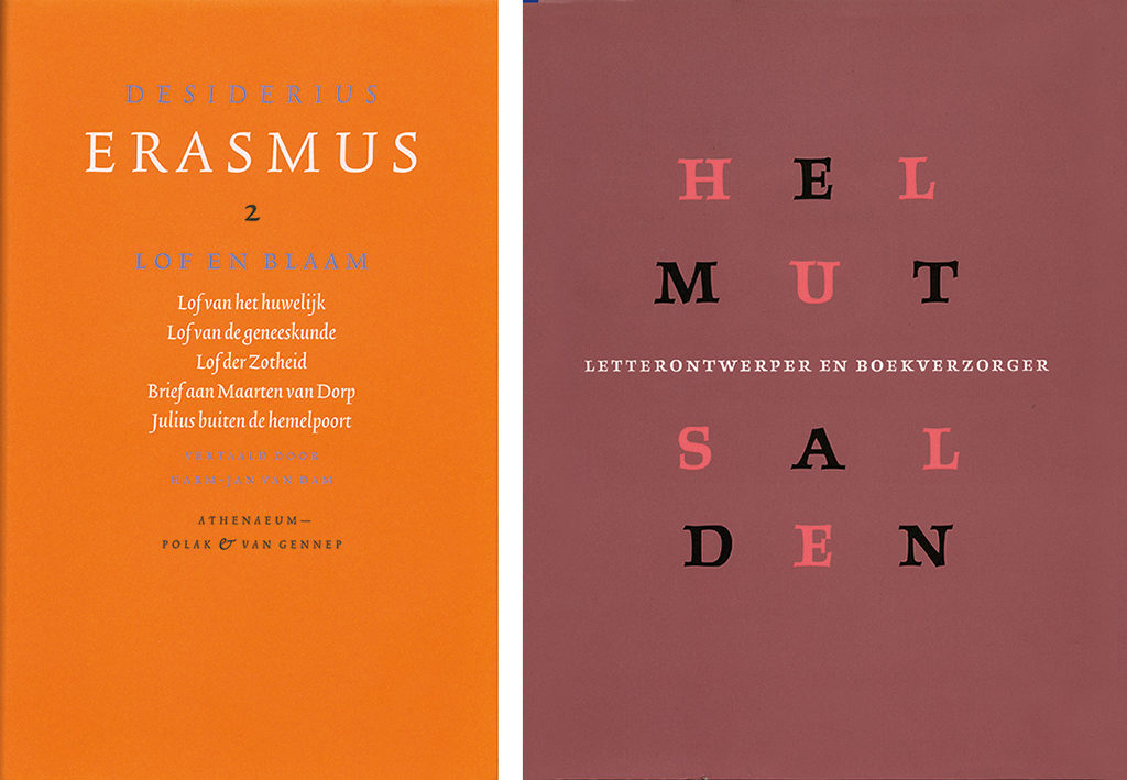
Work: Harry Sierman was a much appreciated and lauded graphic designer. Status he had, but what was his position in the profession? He was often seen as a traditionalist, but was he? Yes, he loved the history of things and probably always kept one leg standing in the past. He remained true to himself through all of his long career, but should not be mistaken for a conservative. He loved quoting the severest, strictest typographers but never became dogmatic in his thoughts and approaches himself; he loved life and liveliness too much. And he loved ‘the game of typography.’ In 1976, as Harry finished the design of a letterhead for Lucas Bunge, the spontaneous comment he received said: ‘… a pleasure to look at, this toffee-nosed simplicity that only shows its haughtiness to the insider.’ The words of a devoted client and friend in admiration of Harry Sierman’s jewels.
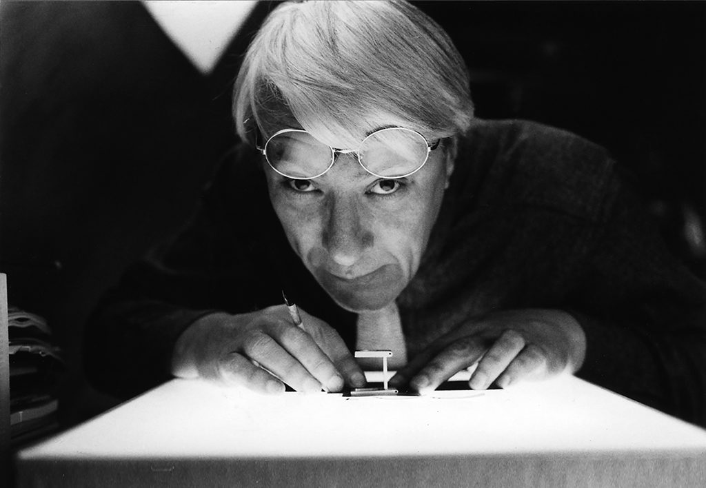
Harry Sierman
born on 17 May 1927, Amsterdam
died on 22 May 2007, Amsterdam
Author of the original text: Koosje Sierman, September 2007
English translation and editing: Ton Haak
Final editing: Sybrand Zijlstra
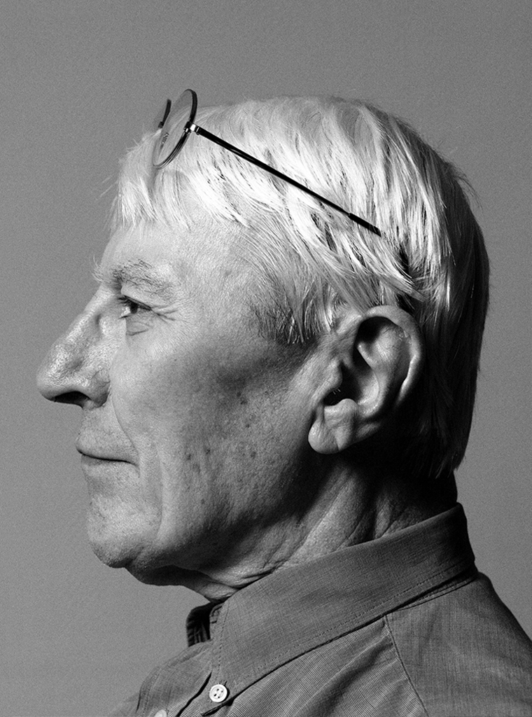
Portrait photo: Aatjan Renders
