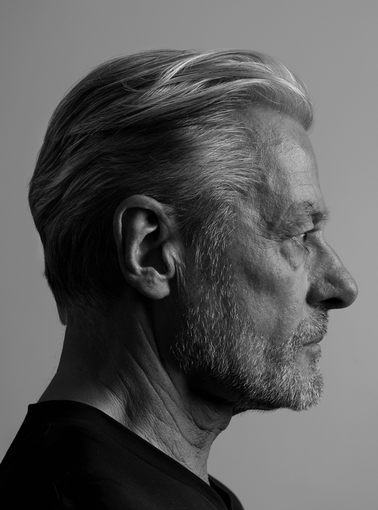
Jelle van der Toorn Vrijthoff. Born in 1946 in The Hague. Four brothers. His father was an interior designer. He studied at Koninklijke Academie voor Beeldende Kunst. He worked as a freelance designer before attending Royal College of Art in London. Back in the Netherlands, he joined Staatsdrukkerij en ‑Uitgeverij (government printing and publishing house) to lead their graphic design department. In 1982, he joined Total Design in Amsterdam. In 2002, after twenty years, he resigned as TD’s creative director in order to continue as a freelance designer. He was involved with huge museum projects in Oman and Yemen. In 1989, he had joined the Freemasons. He became the presiding master of the Amsterdam ‘Loge La Bien Aimée’ and an officer of the Grand Orient of the Netherlands. All of his life he was fascinated with Japanese martial arts. His fascination with the enigmas of creativity drove him to write a book about his experiences and vision.
Guus Ros interviewed Jelle van der Toorn Vrijthoff for Roots.
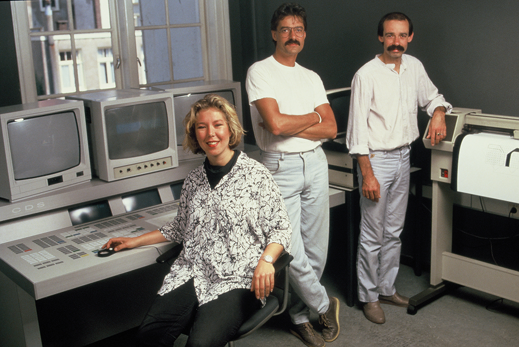
Désirée Deklerk, Jelle van der Toorn Vrijthoff, Joost Klinkenberg at Total Design, 1985
Tell me about your youth.
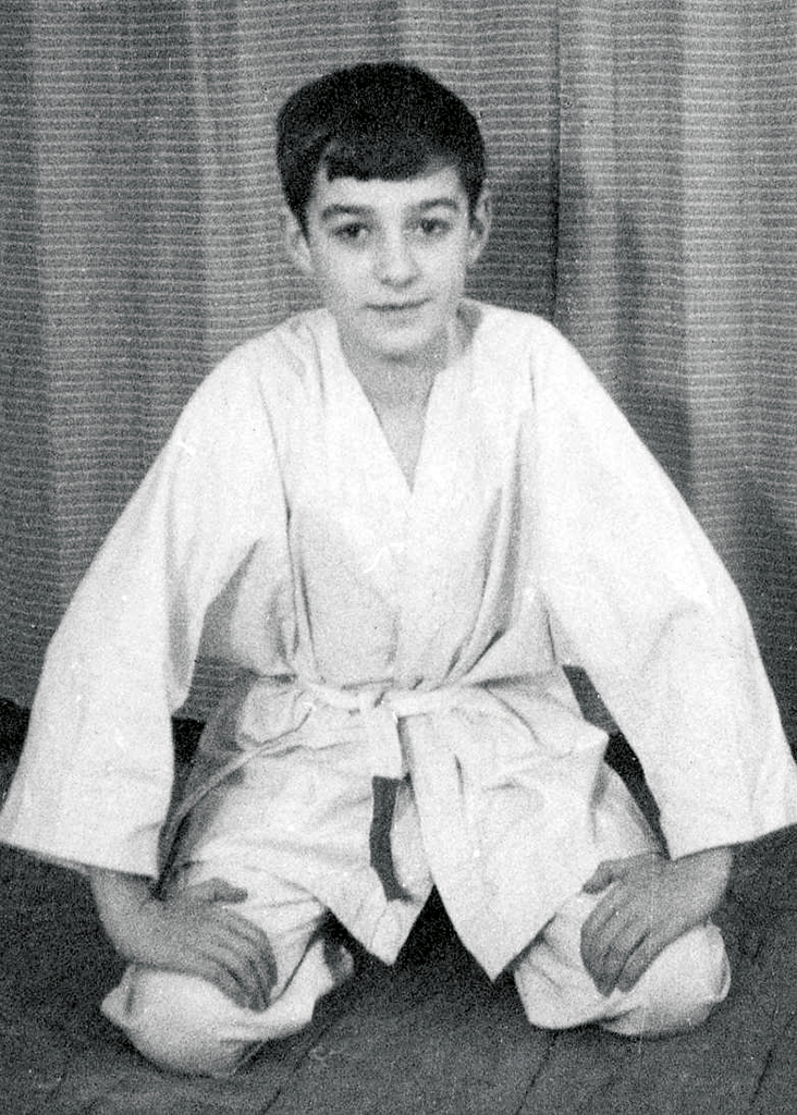
To draw was what I wanted to do. I was a skinny kid, fragile because of asthma, and I lacked self-confidence. On advice of our doctor, my parents sent me to judo class at age eleven. Good advice. Slight of posture as I was, I could only keep up by smartly applying technical skills. I could really appreciate the principles of a disturbed equilibrium as formulated by Jigoro Kano. Eventually I won respect; self-confidence followed. I had set the first step of breaking away.
What other interests did you have?
At home, we read comics like Tom Poes en Ollie B. Bommel, Eric de Noorman and Kapitein Rob. Dick Bos too, but in secret. Kuifje magazine with drawings in Hergé’s so distinguishing ligne claire (clear line), and we would fight over Donald Duck. Later, I subscribed to Stripschrift and their approach to comics would influence me for the rest of my life.
Where were you schooled?
At age fourteen, while attending four-year MULO (lower secondary education), my father sent me to the Vrije Academie (free academy of art) in The Hague’s Boekhorststraat, notorious for the beatniks that ran the place. On Thursday evenings, Ton Hoogendoorn taught graphic techniques. I didn’t grasp the exact purpose, but I surely enjoyed the experience. The wild painter Jan Cremer was throwing paint at canvases in the neighboring classroom. On Saturday afternoons, I started to attend drawing class at the Royal Academy in The Hague. When I failed the second year of MULO, I wanted to enter the academy immediately, but was told I had to be able to show a MULO certificate. My mother interfered: she went to see J.J. Beljon, the academy’s director, to show him my ‘portfolio’. Beljon was agreeable, but told her that I should first finish at least three years of school. To which my mother reacted by paying my MULO’s director, mister Kramer, a visit. She told him my story and convinced him I shouldn’t repeat the first year but be allowed to enter the second year of the three-year MULO. Mister Kramer falsified my scores…
And later?
In 1961, I entered the academy to study graphic design, their four-year course.
You were fifteen. A youngster.
I was the youngest of all and had to grow up fast. My years at the academy passed in a whirl of excitement. Lots of parties. Nights without sleep. I wasn’t easy to deal with but showed ambition and had all the energy of the world. I knew of only one way: straight ahead and leading the pack.

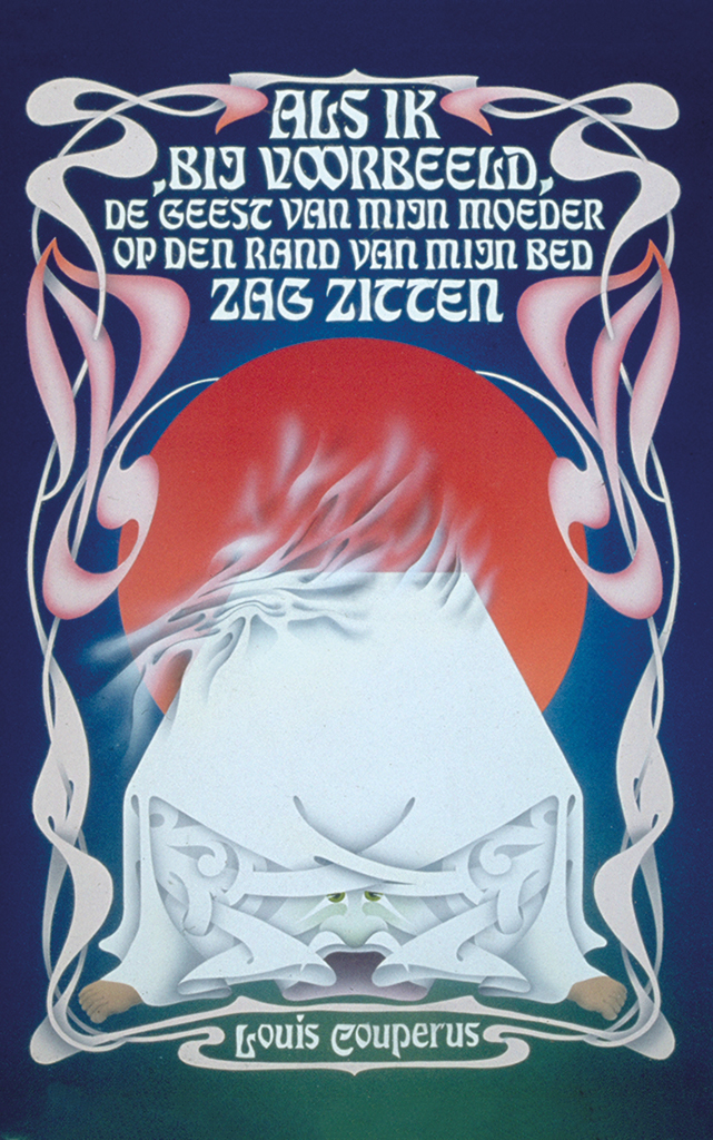
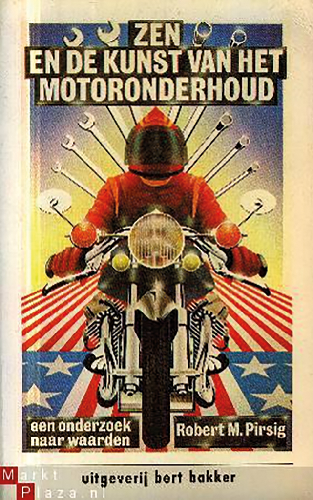
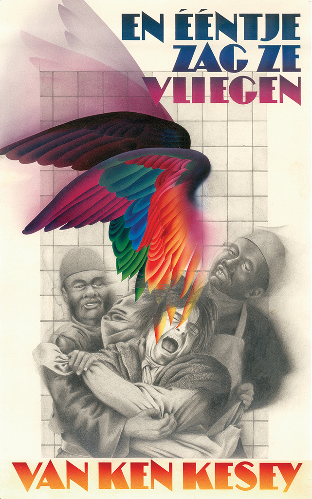
Book cover designs for publishers Bezige Bij and Bert Bakker. Mixed technique illustrations, airbrush and pencil, extremely time-consuming.
The most important lesson you learned?
There were so many lessons I learned… In 1963, Total Design was founded. An older student, Pieter van Delft, was offered a job at TD. The design walhalla! This made me understand what was possible. Bob Dylan paved my road to maturity. The work of the New Realists was exhibited at Haags Gemeentemuseum. Roel van Duyn preached his beliefs; in politics, the Kabouters and Provo confronted the establishment; the poet Johnny the Selfkicker performed unlike anyone else before him, literally in a breathtaking way. My teachers were purists such as Jan van Keulen and Gerrit Noordzij. I graduated with honors. I couldn’t wait to move on.
The Royal College.
I went to London to visit the Royal College of Art and Gert Dumbar showed us around. I was deeply impressed. I decided that my next phase had to be in London, attending RCA. But my parents couldn’t afford the fees, so I started working from home as a freelance designer. I got jobs from DEV, where Hein van Haaren was responsible for watching over the aesthetics of PTT. Van Haaren would be my guiding light and private mentor throughout my career. Piet Cossee taught me the fine distinctions of typography insofar Gerrit Noordzij hadn’t taken care of this at the academy. Each year, three grants were made available by the British Council to people who wanted to study in the UK. I didn’t give myself much chance, but decided to go for it anyway.
How did you approach the problem?
Van Haaren wrote a recommendation and mobilized enough support to get my name in the list of candidates. The problem was, you had to be age 23, and I was only 21 – so, my name went to the back-up list. I was very disappointed. But I decided I wouldn’t let this blow influence my decision; it would only be a postponement.
So, in the meantime?
At the Bazaarstraat address of DEV, Van Haaren organized an exhibition of corporate identity programs in their small gallery. This was part of his strategy how to convince PTT’s director-general of the importance of such a program for the organization. On show were the corporate identities of British Rail, PAM and NS, the Dutch railways. I got involved with the design of the exhibition and was introduced to the structural aspects of identity programs, their rationality, their functionality, the rules and instructions as written down in manuals. This was the moment that I first understood that the computer would eventually protect us designers against boring repetitive tasks. One year later, I reapplied for the British Council grant, and I got it! In September 1969 I moved to London and found an apartment in chic Kensington.
You were 23 and all alone.
My first year at RCA wasn’t a sinecure. In the beginning I had a hard time to follow conversations and instructions in the English language. Our teachers were real Brits, like Jock Kinnear and Margaret Calvert, and Americans like Bob Gill and Lou Klein. Gill was the founder of Fletcher, Forbes & Gill, the precursor of Pentagram; they were concentrating on conceptual thinking rather than graphic styling. So different from what was moving the Dutch: Swiss typography and German industrial design. Marello Minale, of Minale Tattersfield, taught for a brief period. Meanwhile, the first year raced to the end, and I had to worry about finding the funds to survive a second year in London.
How did you manage?
I returned to The Hague to apply for a grant from the Dutch ministry of cultural affairs. I bet Hein van Haaren jumped in again and supported me. Anyhow, my second RCA year was secured. I kept thinking about the advantages of automatization of certain aspects of the profession and began looking for more information, e.g. about automated typesetting techniques. I ended up talking to Herbert Spencer, the graphic designer, researcher, author and teacher at RCA’s Printing Research. He referred me to someone at the Experimental Cartography Unit, where they researched typesetting systems for the typography of maps. I was told I’d better learn how to write computer programs if I wanted to make some progress in the field. The RCA arranged for my participation in a course for programmers at the Imperial College of Science and Technology. I learned how to make punched paper that could be fed into a phototype machine at the London College of Printing and create film. I wanted to write programs that simulated the processes of typography design. For my pilot project I chose the design of documents and forms; it was not too difficult to develop their algorithms and to create computer programs. I discussed the matter with designers at Her Majesty’s Stationary Office, the group that designed forms. I was highly surprised that they had a group of specialists doing the work that so many graphic designers just despised.
The second year at RCA. A success?
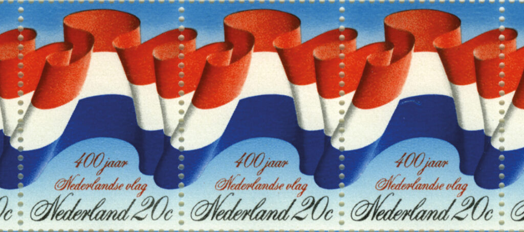
1970 became a very inspiring year. I encountered the Quay Brothers who studied at the illustration department and were into stop-motion animation. We became good friends. In the summer vacation I went to the US. I worked in New York after showing my slides to several studios before finding an opening at Jeheber and Piece, a small studio. Great fun. And I made some money to explore the country on a $99 ticket-to-ride. Later in 1970, PTT assigned me to the design of a stamp commemorating the 400th anniversary of the Dutch national flag. My first design, said Van Haaren, was too frivolous to submit for the approval of the director-general. My second proposal presented the flag waving in the wind, as it was often depicted by 16th-century or 17th-century painters of sea battles. For better effect I designed the flag as a horizontally continuing image. The type had to follow this pattern and I selected the Spencerian Bold, a font I had discovered while working for Jeheber and Piece in New York.
Stamp for PTT at the occasion of the 400th anniversary of the Dutch national flag, inspired by sea battle painters like Hendrik Cornelisz Vroom. The waving flag continues from stamp to stamp.
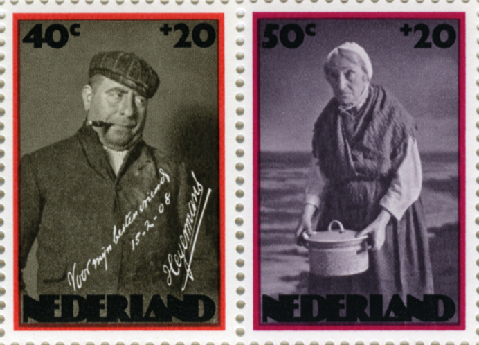
Summer stamps for PTT, 1974
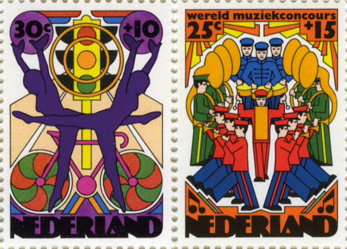
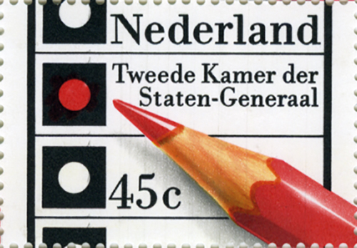
Election stamp, 1976
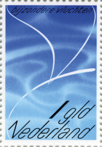
Trying to avoid images of airplanes or birds in a stamp commemorating special flights, an abstract image was created based on comics drawn by Willy van der Steen and Maarten Toonder. The typography was designed especially for this stamp, a simple sanserif in 45 degree italic.
Did you have enough money left to return to the UK?
Only just. At the beginning of the third year I was broke. I managed to get a loan from The Netherlands Benevolent Society in London, founded in 1874 (talk about tradition). My third year was saved. In this year, designers like David Pelham, Peter Bentley, Philip Castle and the Quay Brothers were my inspiration. Philip Castle made me work with airbrush. The Quay Brothers made me use the graphite pencil again. The year passed quickly; before I knew it the graduation exhibition had to go up.
The world was lying wide open?
I looked up admiringly to Pentagram in the same way I had looked up to Total Design in the 1960s. Alan Fletcher, Theo Crosby and Colin Forbes had founded Pentagram in 1971. These three gurus came to see the graduation exhibition. Fifteen minutes and they were gone. We watched them full of admiration, while they didn’t even deem us worthy of a glance. No one was invited for an interview.

Thalys high-speed trains
(with Olivier Dupuis)
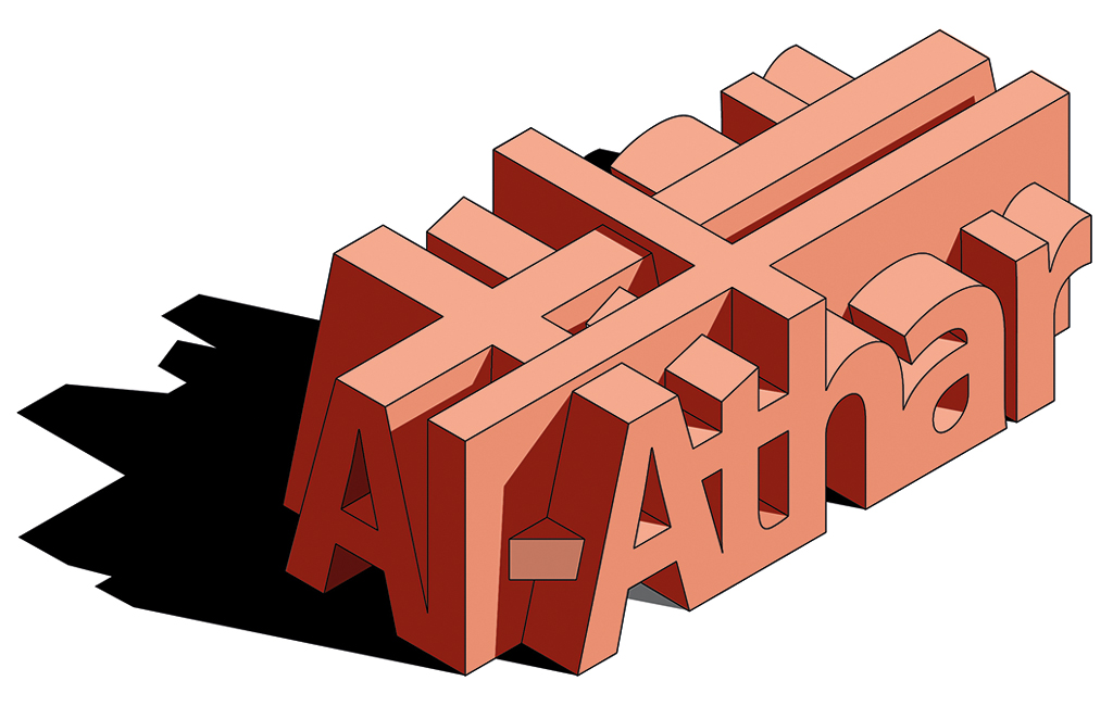
construction company Al-Athar, Yemen
Allseas offshore construction
Heikona accountants (‘What is more suitable than a magic cube?’)

PTT Telecom (not introduced)
Center for the Development of Creative Thought, Antwerp
Did you continue your studies?
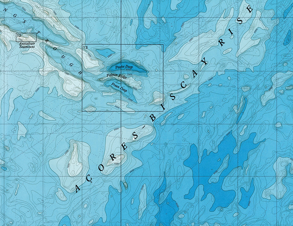
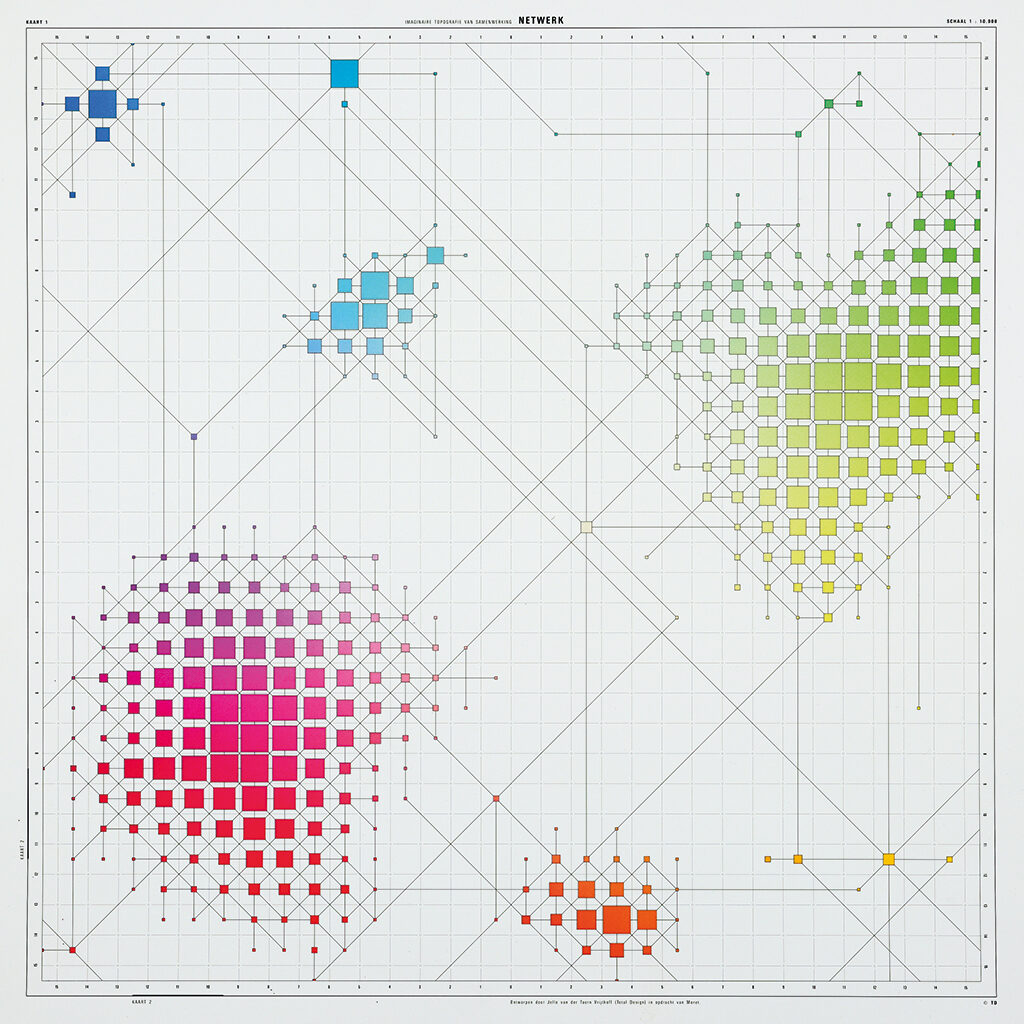
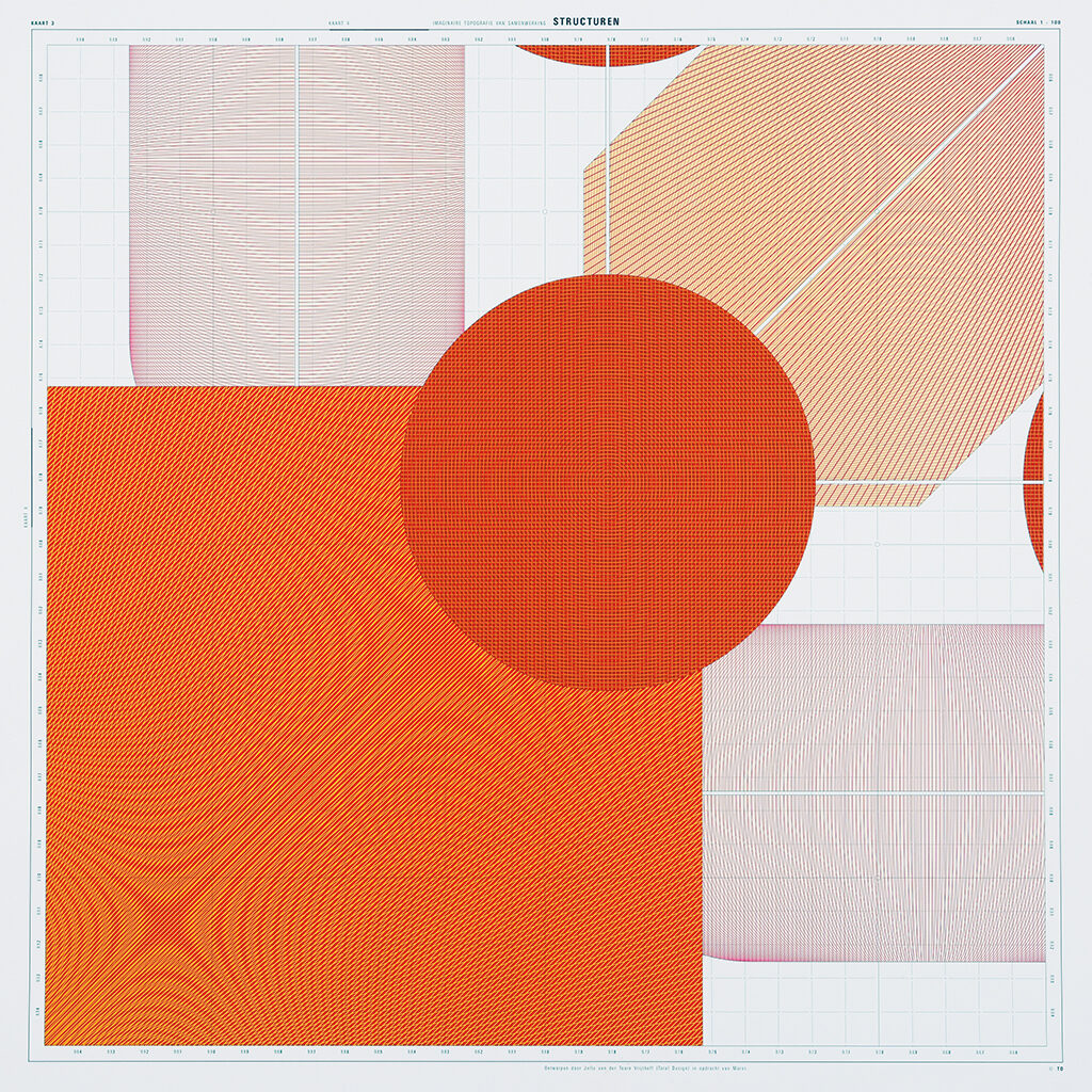
After I had acquired my masters, I was asked to teach for two days a week at Hornsey College, at their department of Information Graphics. That’s where I got acquainted with infographics and with scientific and medical illustrations designed in a way we didn’t know in the Netherlands. I also found a job as a cartographic designer/research fellow with the Experimental Cartography Unit. All of my colleagues were programmers, I was their first designer. It may have seemed to be a new métier, but I discovered an ages-old craft with its own traditions, rules, codes and international conventions, some of which dated from the time of Leonardo da Vinci. As a graphic designer I licked my fingers – gravure foils, stabilene films, mask foils, punch card register systems, hypsometric color catalogs, and more. I was tasked with the design of a huge map of the bottom of the Atlantic Ocean for the National Institute of Oceanography (later renamed the National Oceanography Center). A map of the seabed doesn’t differ much from a map of the earth; there are mountains, valleys and canyons, but all colors are tints of blue. On the left was New York, to the right was Portugal. I loved the work; it all came back when at TD I was commissioned by Moret en Limperg to do a job which was about generalization of details at a changing scale. Between teaching class and designing cartography I had to find time for my freelance job as an illustrator for Spectrum Encyclopedie; these Dutch publications were produced in London after John Stegmeijer had designed them under Wim Crouwel’s supervision.
Metamorphoses in cartography, for The Experimental Cartography Unit, London
Moret en Limperg, five cards showing the same image in different scales (with Frank Adegeest)
Back to the Netherlands. What came next?
In 1973, I was back in the Netherlands and started as a freelance designer. I wasn’t happy with the situation and looked for a small studio to join. Ootje Oxenaar mentioned Gratama en De Vries and I joined them at Smidswater in The Hague. A little later, TD called with an offer. I refused.
Ten years later, TD was no longer walhalla?
Only later I understood that at the time they had approached me they were going through their first crisis. Benno Wissing was leaving and with him more important designers decided to move on. At Smidswater in The Hague, my ambitions were colliding with the viewpoints of my partners. Hein van Haaren, now a director at Staatsuitgeverij (Sdu), asked me to lead their graphic design department. I grabbed the opportunity. It became a most instructive time during which I learned how to manage teams. The design department’s top guys were heavyweight typography designers like Hans Kentie and Karel Treebus. They created parliamentary papers of such unique typographic beauty and simplicity… An exciting project was the identity program for BiZa, the Dutch ‘Home Office’. We had to collaborate with BRS from Amsterdam to learn how to spar with an outside studio. Both of our teams were willing to collaborate professionally and deliver. We operated as one team. It was cooperation 101; we even exchanged staff to learn from each other. We trusted each others’ professionalism.
But you moved on.
In 1978, I was invited to join the prestigious Alliance Graphique Internationale, AGI. At the time it was still a small organization of internationally recognized professionals. I was the junior among rock stars such as Massimo Vignelli, Herb Lubalin, Milton Glaser, Shigeo Fukuda, Alan Fletcher, David Hillman, Arnold Schwarzman, Saul Bass, Wim Crouwel, Pieter Brattinga, and so on. Paradise. During my first AGI congress, in New York, I had to stand in for Colin Forbes (Pentagram, NY) and deliver a speech at NY State University. A huge audience. I had the shakes.
Stage fright. Did it continue to bother you?
I got accustomed to perform in public. In 1981, Total Design contacted me again. I guess it was the time of another crisis. Wim Crouwel was leaving. In 1982, I was appointed to deputy-director. It was 1994 when I became TD’s creative director.
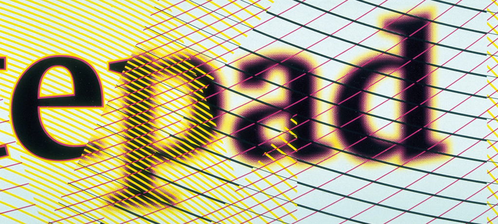
Early experiments with patterns, structures and vague type (with Frans Lieshout)
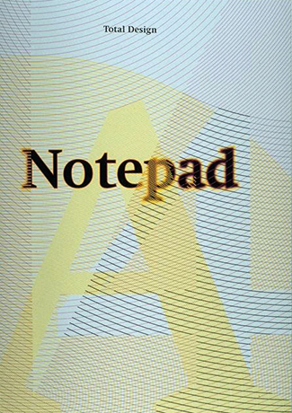
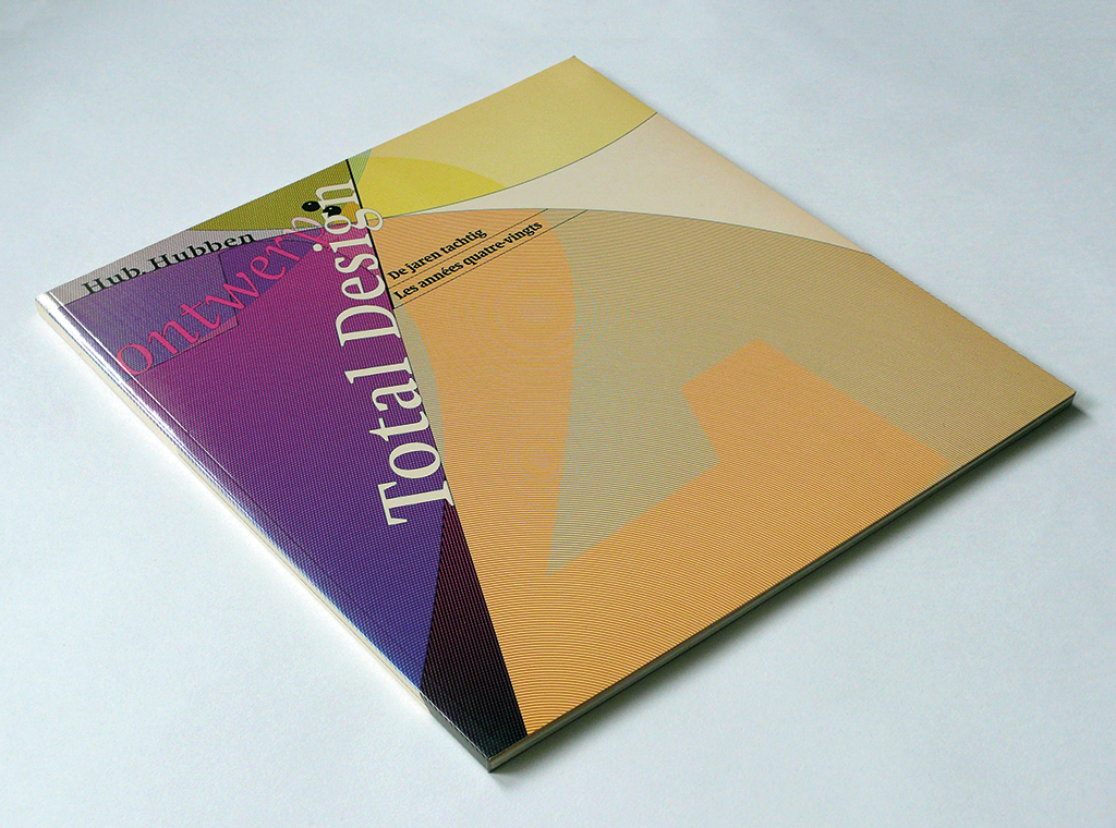
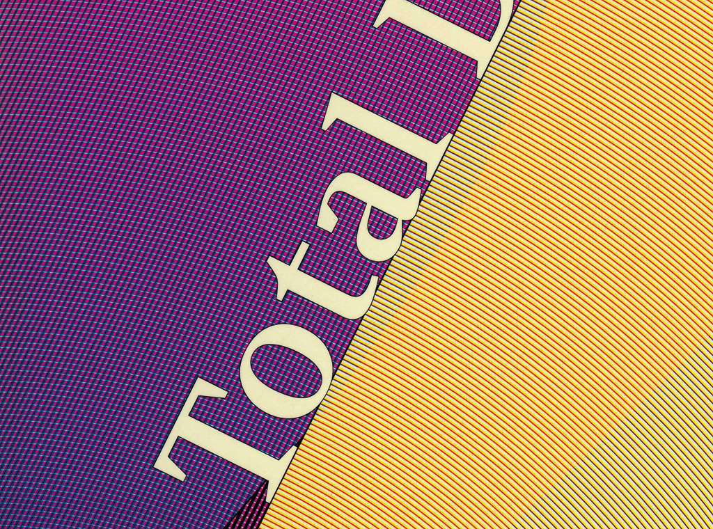
Cover of the book Total Design with different scales changing perspectives (with Frans Lieshout)
Quite some responsibility.
In a private conversation, Wim Crouwel had suggested that I could help TD with entering the computer age. The Aesthedes design computer arrived in 1983. Its arrival announced the death of color-separated layouts. Much has been written about TD and their Aesthedes. As the story goes, it brought TD to beggary. Alas, no nuances are remembered.
Name one of those nuances.
We lost big money on a project in Paris, with grave consequences. Also, don’t forget that in 1985, most established graphic designers still rejected the computer full of disgust. Now everyone sits at his or her Apple and they all accept Adobe’s creative regime. Luckily there are exceptions.
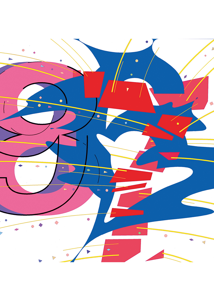
Illustration New Year celebration,
1986-1987
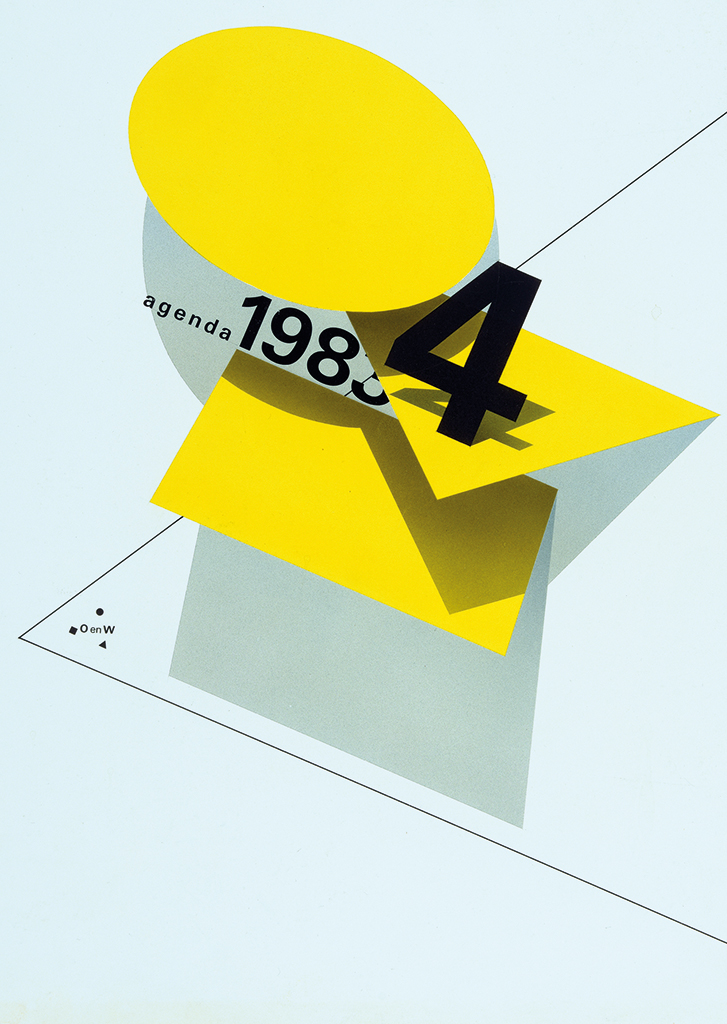
Cover of desk calendar for the ministry of education and culture OCW
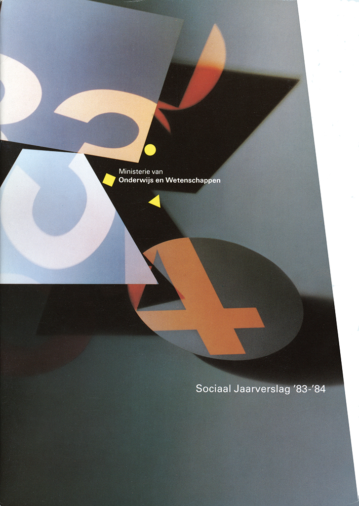
Cover of social annual report for OCW (photo: Frans Lieshout, Bart Versteeg)
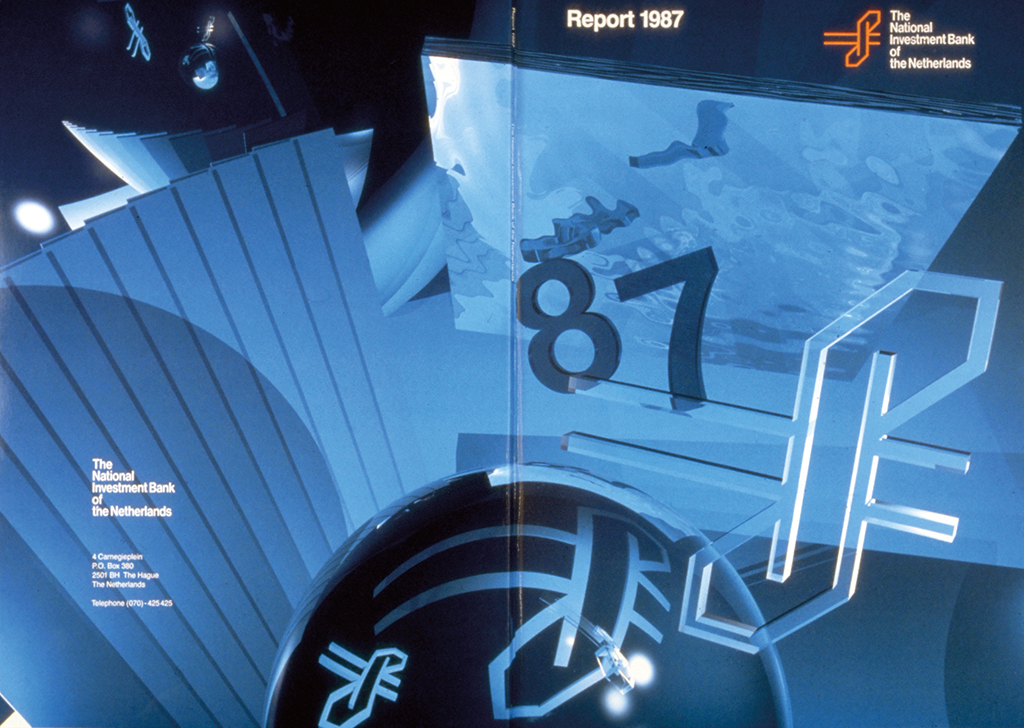
Visuals for annual report, 1987 (with Wim Verboven)
Looking back at your TD years. How was it?
My first three years were dominated by Wim Crouwel’s heritage. The studio was facing big changes and in my viewpoint their history of twenty years at the top had to be used as a platform from which to depart on new journeys. Functionality had to be cherished, but form had not necessarily to follow function. Less dogma, more impulsive creativity. New techniques should be seen as impulses for a new quality. My twenty years at TD were defined by high mountains and deep valleys. Threatening bankruptcy next to the joy of great projects in the Netherlands and abroad.
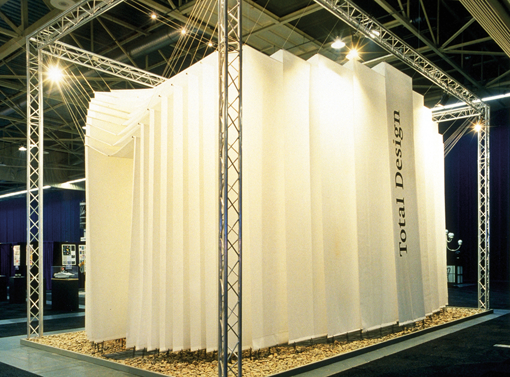
Exhibition stand created from paper, Total Design
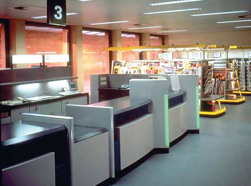
Design of post office interiors, 1990 (with Stan Spangenberg, Matthijs Neven and others)
Did you leave behind TD in a good position?
I tried hard to do that, along with many colleagues. The last large commission I undertook was the design of the National Museum in Yemen, a complicated project. For four years in a row I had to spend two weeks of every month in Yemen, from 1998 to 2002. I acquired much insight in the Arab culture and a nuanced view of Islam. I discovered their abstract imaging to be of extraordinary beauty. Our problem at TD had to do with succession, never an easy phase. How many bureaus managed to survive such a changing of the guard? At the time I left TD, in 2002, the studio was guaranteed to continue as Total Identity. Hans Brandt succeeded me. He was to steer the studio through new states of confusion.
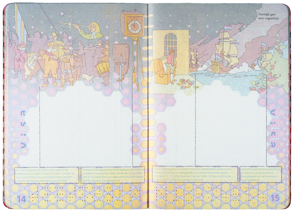
Influences of the ligne claire (as Joost Swarte called Hergé’s style) became visible in the design of the Dutch passport, 2000. André Mol created the extremely detailed drawings.
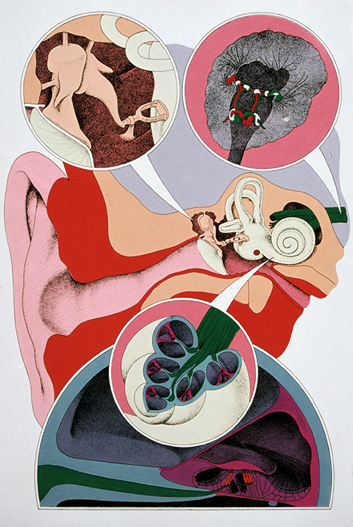
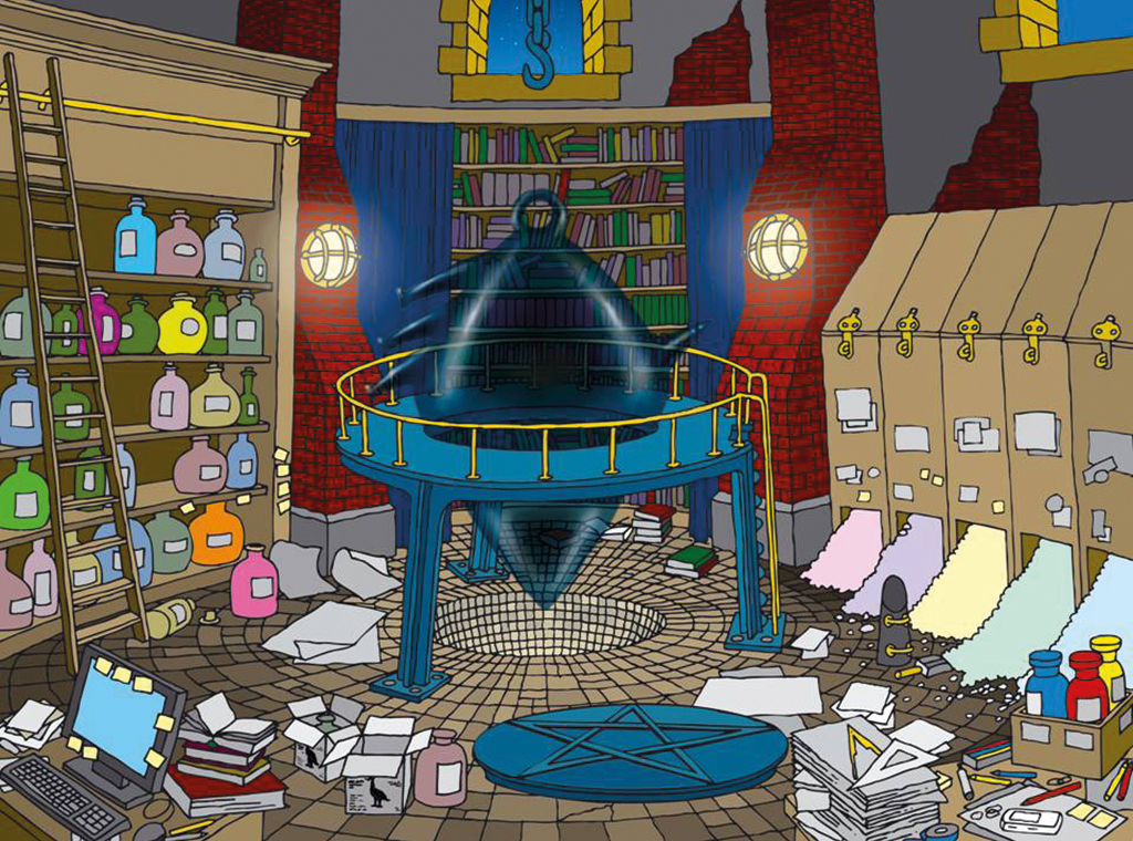
André Mol also illustrated a book about hearing; and a publication for the Center for the Development of Creative Thought, Antwerp.
And now you are 57. Rather young for a former director. What will the future bring?
As a freelance designer I was able to play around and accept all sorts of commissions. One that stood out was the design of the Ecoman Science Center in Oman. Another one was the design of the Masonic Museum in The Hague. And I worked on my book, although with long interruptions.
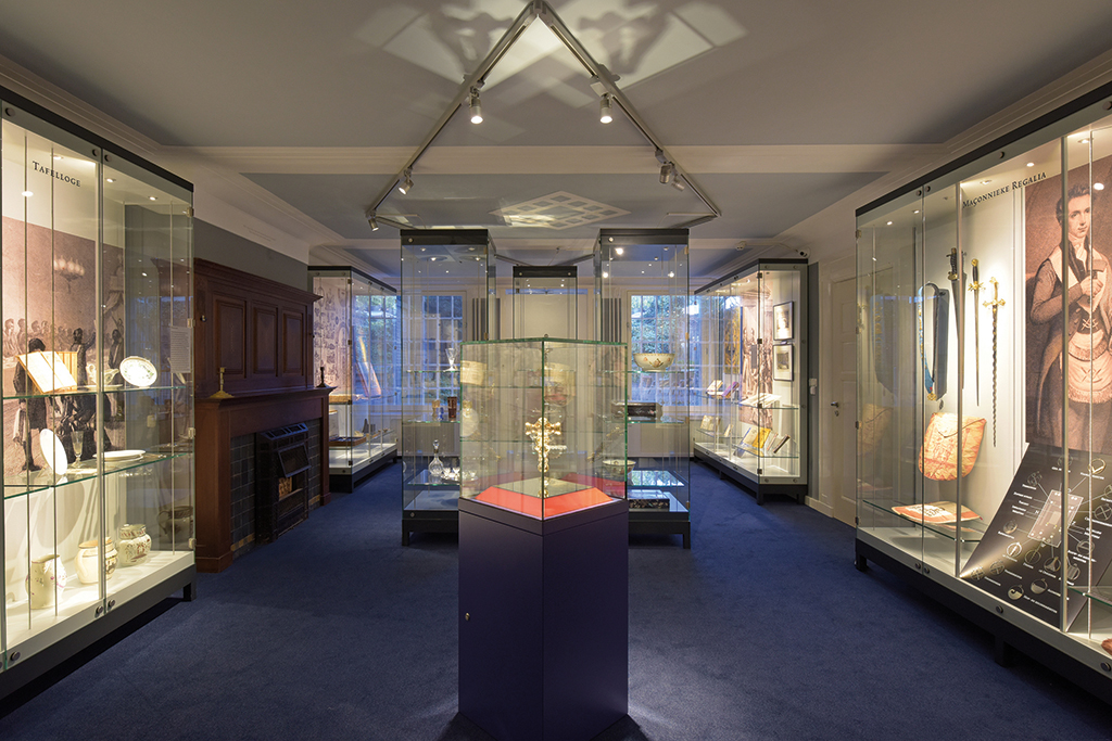
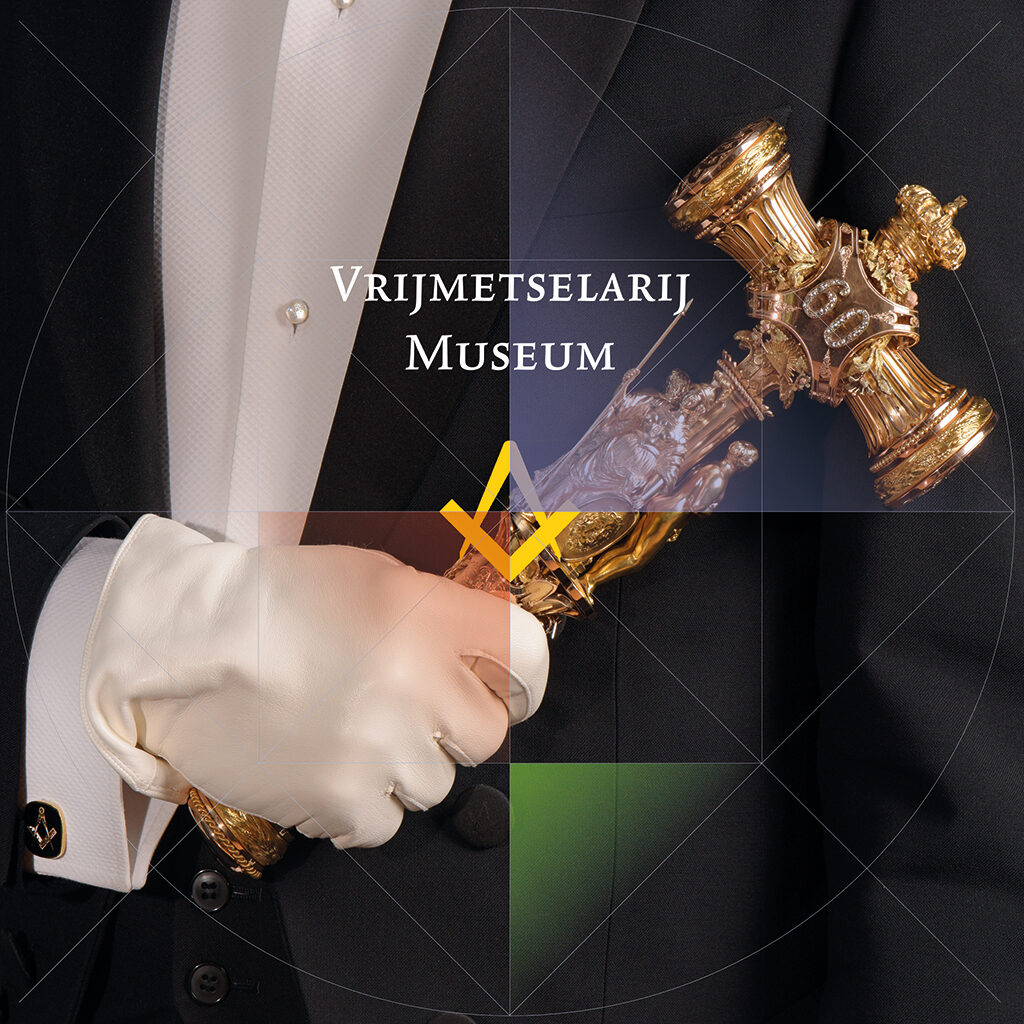
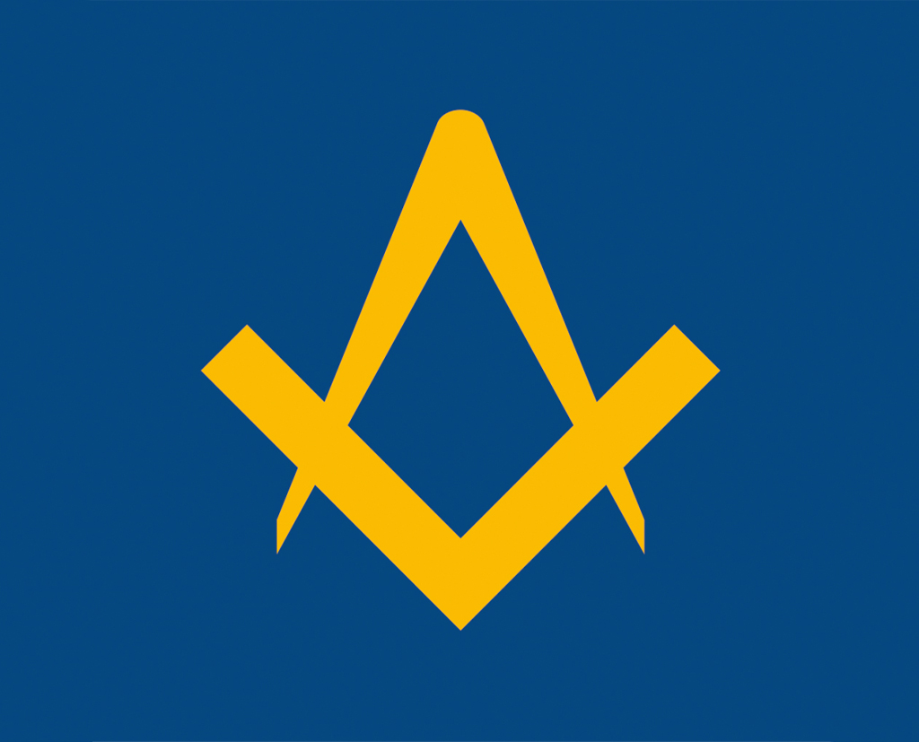

The Masonic Museum is open to the public to prevent biased ideas about the society’s secrecy. The museum explains the Masonic rituals and symbolisms (design with Donald Janssen; photo: Gerlinde Geus).
Still fascinated with Japanese martial arts?
After my fourteenth year I knew I wanted to continue with Japanese martial arts. I took lessons in The Hague from a Shokotan dojo. Japanese teachers such as Sensei Kase and Kanazawa came to inspire us and teach us the ‘empty hand’ principle. Tough lessons that improved our wisdom and sense of aesthetics. In London, too, I attended karate class, at the oldest and most famous school, Budokwai, as it happened just around the corner of where I was living at the time. Sensei Enoeda was a hardliner. I learned a lot, but I also broke quite a few bones. After I’d broken my foot and a few ribs, and my hand too, I decided to discontinue and switch to kendo instead; kendo offered more protection. I know no better way to train the body and the mind. Concentration and discipline, respect for your adversary, a decent attitude toward others, and above all: strategy. The book Gorin no sho (The book of five rings) by Musashi Miyamoto is still read in Japan and everywhere else by kendoka as well as business leaders.
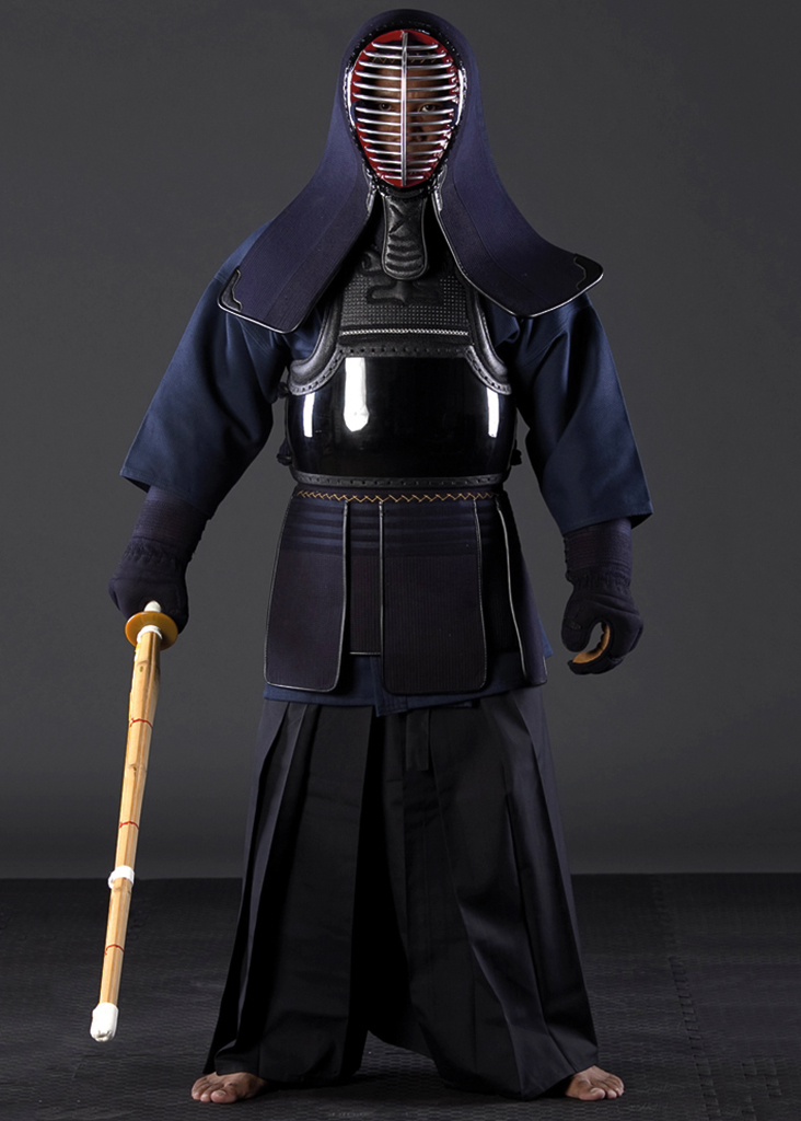
In Japanese martial arts such as kendo, the Samurai traditions can be easily recognized: ultimate control and esthetics.
Young Jelle at judo training
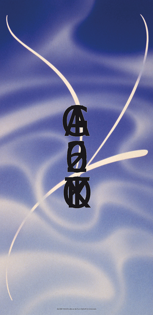
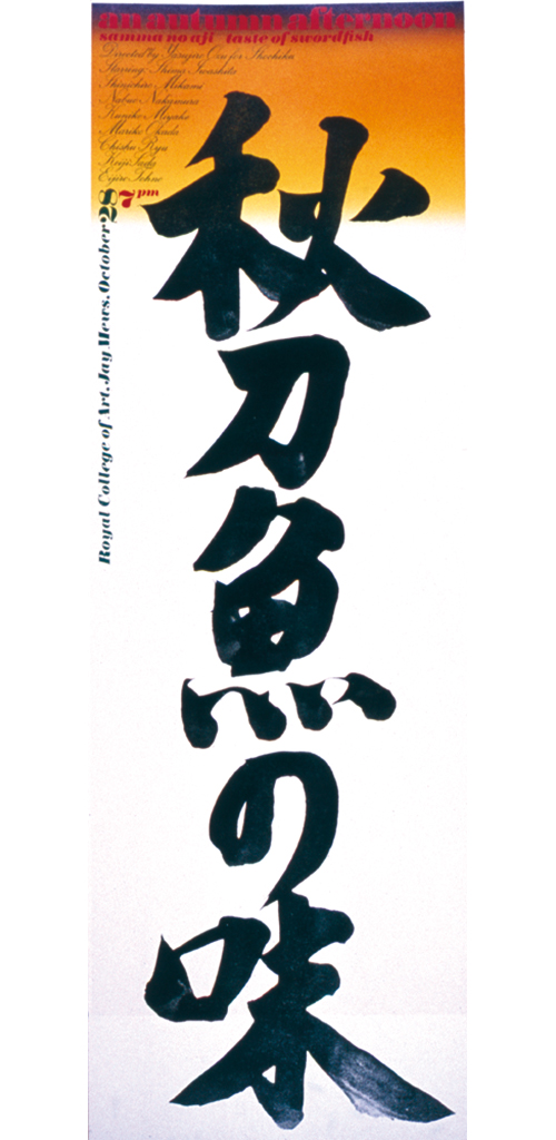
Japanese scroll (kakejiku), for AGI congress, Tokyo, 2006
Poster for Royal College of Art (with calligraphy by Yoshio Hamada)
Any similarities with design?
Kendo and typography have much in common. Kendo is rooted in the tradition of the Samurai. It is an exercise in self-discipline and character building. The functionality of the sword and the gear, the perfect execution of the technique and the absolute splendor of the scoring point. Functionality, technique and beauty are fundamental in graphic design, too.
So, after all these years it was time to write a book?
I’ve been obsessed by creativity as a form of conduct for a long time, and especially by the unpredictability of creativity. Many designers have to cope with this uncontrollable aspect; everything is hunky dory, but before you know it there is a problem and nothing appears to solve it. Most often you find yourself in the middle of the road; only now and then a ‘knock-out’ will be created. Artists and designers should pay more attention to the origins of their ideas and not mystify their métier. We now have scientific proof of neurologic research that certain good designs stimulate our brain in a similar way as some religious images do. I wanted to explore this field and write about it. The book’s title is: The Faces of Faith. Subtitle: If religions would be brands, what would brands learn from religion? The foreword is done and so is the cover – I am a designer after all.
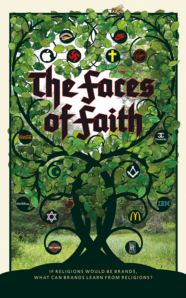
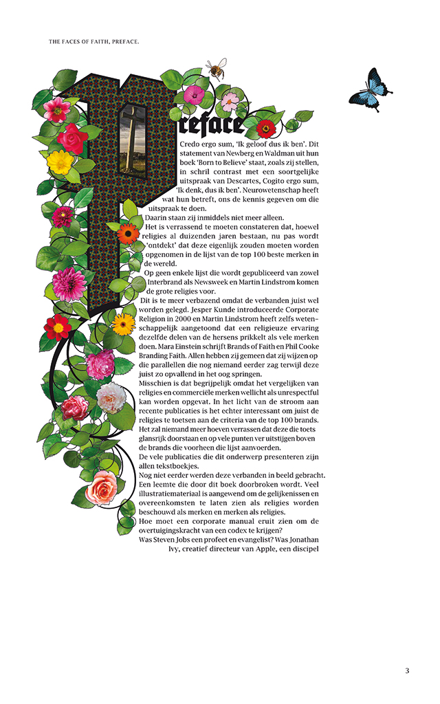
The Faces of Faith, book cover and foreword page design
Jelle van der Toorn Vrijthoff
born on 16 June 1946, The Hague
Author of the original text: Guus Ros, September 2017
English translation and editing: Ton Haak
Final editing: Sybrand Zijlstra
Portrait photo: Aatjan Renders
